The 10 Principles of Art: Definitions and Examples
In the vast history of humanity, art has always been a constant. The necessity of humans to create whether using paint and a canvas, a graphics tablet and a computer, or chisels against stone, has made art a universal language that we all can understand, transcending diverse cultures, immense distances and varied tongues.
But how do artists convey emotions, ideas, and stories using visual elements?
The answer is using the principles of art, which is a much more complex concept than what it seems. These guiding lights help artists navigate the intricate dance of contrast, unity, balance, rhythm, contrast, and movement.
While the art fundamentals or elements of art are supposed to set the foundations of the skills you’ll need as an artist, the art principles are the strategic choices and decisions that transform a blank canvas into a narrative, a story, a feeling… When applied correctly, the art principles are what truly breathe life into your creations.
Despite being so important, since they’re not as popular as the fundamentals, many artists tend to overlook them, especially beginners. In this article, we’ll learn more about each principle and how it affects or how it can improve your work.
- Definition of Art Principles:
- The principles of art are guidelines or tools artists use to organize visual elements in their artwork.
- They are comparable to the grammar of visual language, shaping compositions to evoke emotions, tell stories, or convey ideas.
- Key Principles of Art:
- Balance: The distribution of visual weight, creating stability (symmetrical or asymmetrical).
- Contrast: Juxtaposition of opposing elements (light/dark, smooth/rough) to highlight differences and draw attention.
- Emphasis: Highlighting specific areas or elements to create focal points.
- Movement: Guiding the viewer’s eye through the composition to create a sense of action or flow.
- Pattern: Repetition of visual elements to create structure or rhythm.
- Rhythm: Recurrence of visual elements, creating a sense of flow and motion (e.g., regular, flowing, progressive, random rhythms).
- Unity: The cohesive feeling that all parts of an artwork belong together.
- Variety: Adding differences in elements (color, size, texture) to create visual interest while maintaining balance.
- Proportion: The size relationships between elements or their scale relative to the overall composition.
- Harmony: Ensuring all elements work well together to create balance and cohesiveness.
- Importance of Art Principles:
- They ensure that artworks feel intentional, cohesive, and impactful.
- Used strategically, these principles help artists transform elements of art (e.g., line, shape, color) into meaningful narratives.
- Famous Examples Illustrating Principles:
- Balance: Sandro Botticelli’s The Birth of Venus (symmetrical).
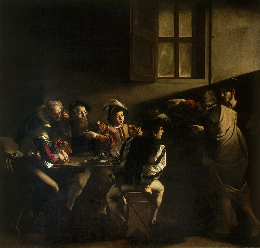
- Contrast: Caravaggio’s The Calling of Saint Matthew (light/dark chiaroscuro).
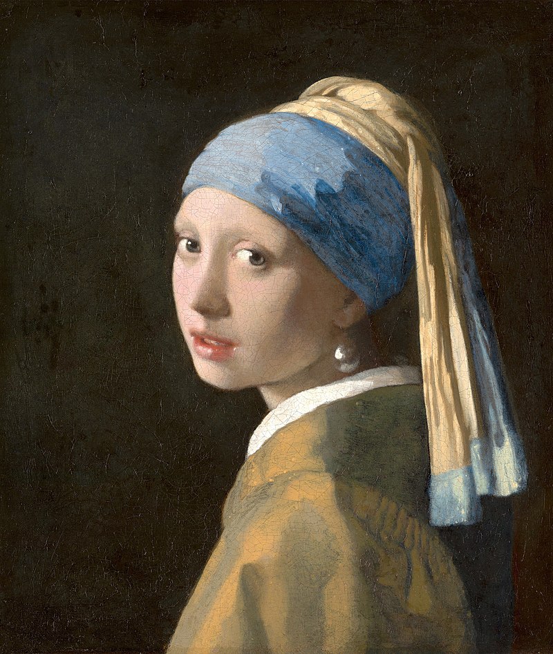
- Emphasis: Johannes Vermeer’s Girl with a Pearl Earring (bright figure against a dark background).
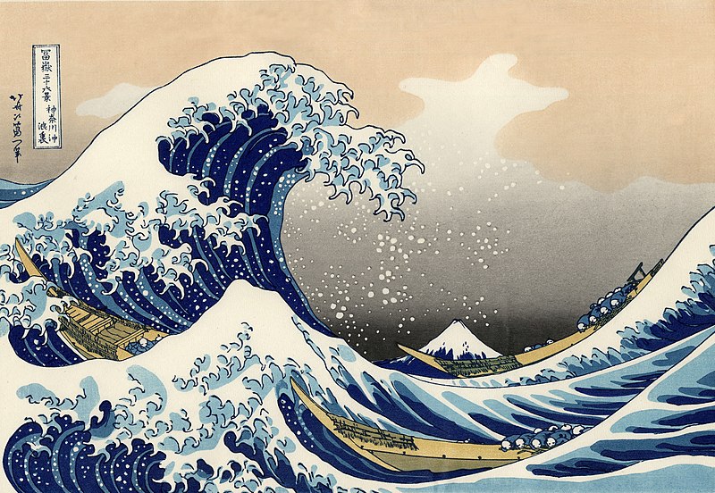
- Movement: Hokusai’s The Great Wave off Kanagawa (dynamic wave composition).
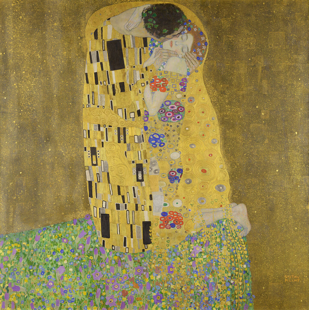
- Pattern: Gustav Klimt’s The Kiss (golden motifs).
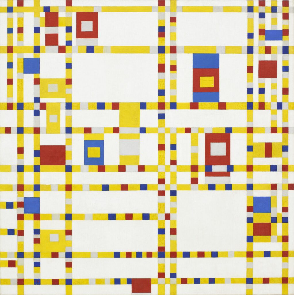
- Rhythm: Piet Mondrian’s Broadway Boogie Woogie (regular rhythm).
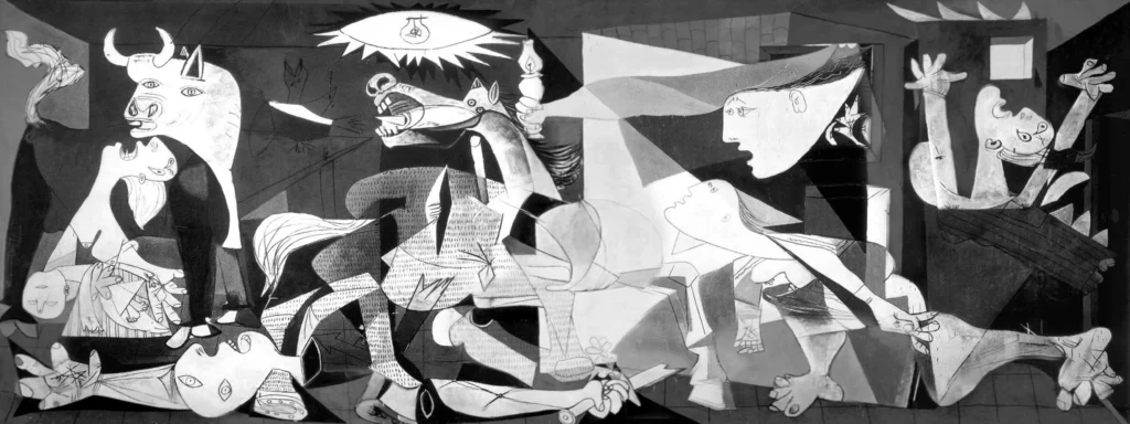
- Unity: Pablo Picasso’s Guernica (monochromatic cohesion).
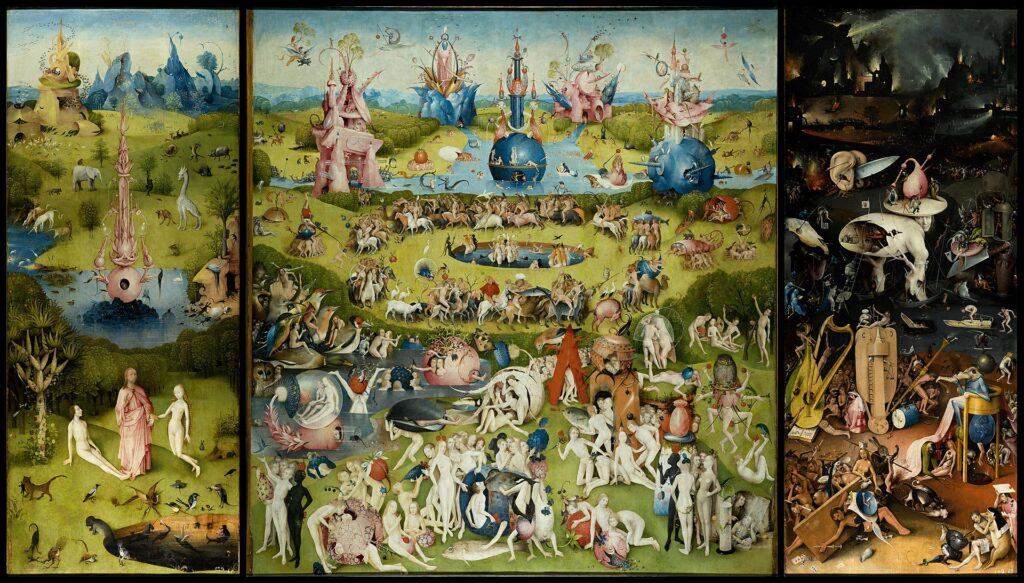
- Variety: Hieronymus Bosch’s The Garden of Earthly Delights (diverse creatures and textures).
- Proportion: Albrecht Dürer’s Adam and Eve (idealized figures).
- Harmony: Claude Monet’s Water Lilies (consistent color palette and theme).
- Art Principles vs. Art Elements:
The elements (line, shape, color, etc.) are the building blocks of art, while the principles organize and bring these elements to life.
So grab your favorite sketchbook and get ready, we’re about to embark on a journey that will reshape the way you approach your art.
What are the Principles of Art?
The 10 most important principles of art are:
- Balance
- Contrast
- Emphasis
- Movement
- Pattern
- Rhythm
- Unity
- Variety
- Proportion
- Harmony
In simple words, the principles of art are the guidelines, or visual tools, that artists use to organize elements within their artworks. Art principles act as thе “grammar” of visual languagе, shaping how individual componеnts comе togеthеr to convеy mеaning, evoke emotions, and guidе thе viеwеr’s еxpеriеncе.
Just as grammar rules help structure sеntеncеs in language, thе principles of art give structurе to visual compositions and ensure that the artwork fееls cohesive, intеntional, and impactful.
Now, let’s learn more about each of the Art Principles:
1. Balance
Balance refers to the distribution of visual weight in a composition. Balance can be symmetrical, where both sides of a composition are even, or asymmetrical, where you can create balance through contrasting elements of different sizes or positions.
As an analogy, imagine you have a seesaw, you can put two elements of the same weight on both sides or a big, heavy element on one side and multiple smaller elements on the other side. In both situations, the seesaw remains balanced.
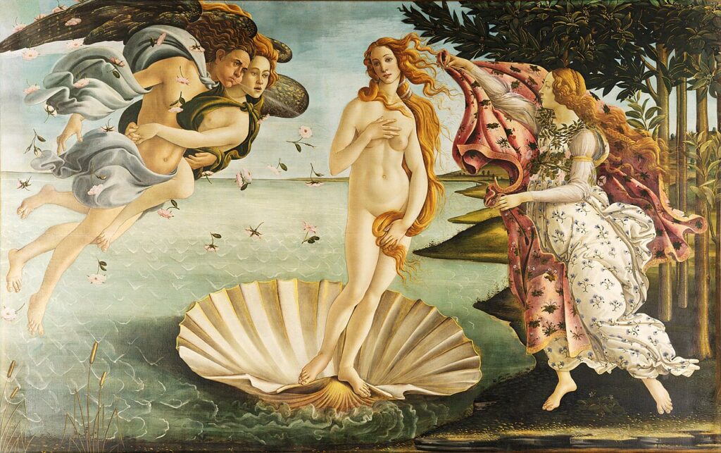
In an artwork, art balance means that nothing feels like it’s going to “fall” out of the picture, in the iconic painting, “The Birth of Venus” by Sandro Botticelli we can see an example of symmetrical balance, where the main subject is flanked by two equally “visually heavy” elements making it perfectly balanced:
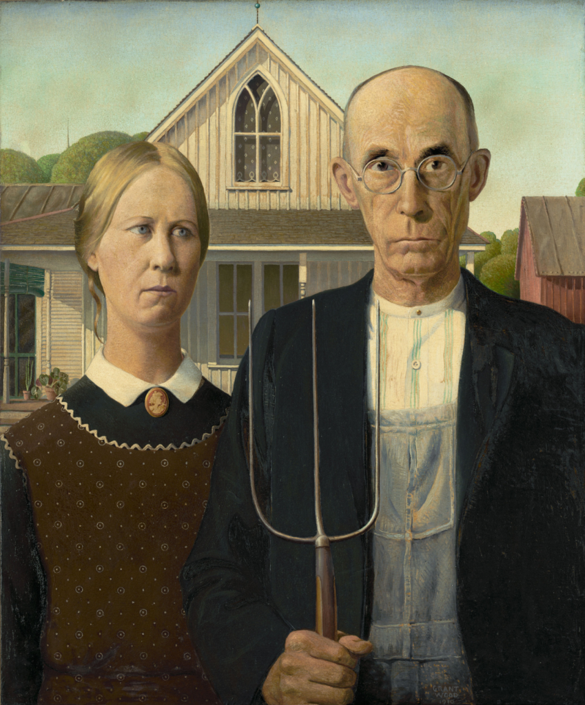
Another example of balance in art is in the classic painting “American Gothic” by Grant Wood. In this artwork we can see balance created by the farmer and daughter being side by side, with the window in the center of them. Nothing appears out of place, empty or too heavy visually.
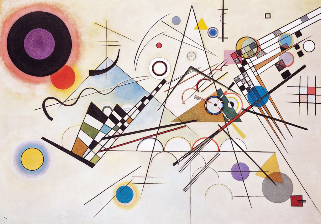
In contrast, in Wassily Kandinsky’s “Composition VIII” the balance is completely absent. Being an abstract painting where the author wanted to break away from the constraint of representational art, and express the meaning of color through shapes scattered on the canvas, this composition achieves a unique dynamic feel but lacks the visual harmony we’re used to in more traditional representations.
2. Contrast
Contrast in art refers to the grouping of opposite elements near each other to highlight their differences. When used properly, contrast can help accentuate the difference between the elements in a piece, it can be used applying light versus dark, rough versus smooth, or large versus small.
Contrast is often used to grab the viewer’s attention and guide them through the most important parts of the artwork, highlighting not only the main visual elements but also emphasizing the emotions or ideas within the artwork.
Without proper use of contrast, the elements on your canvas might blend together. Non-contrasting elements may appear bland and cause the viewer to lose interest quickly, or cause them to feel overwhelmed trying to understand the underlying message.
One of the most popular works where we can see a strong representation of contrast is Caravaggio’s “The Calling of Saint Matthew” where through the chiaroscuro technique we can see clear and eye-catching contrast produced by the “divine light” illuminating Saint Mathew and the others:
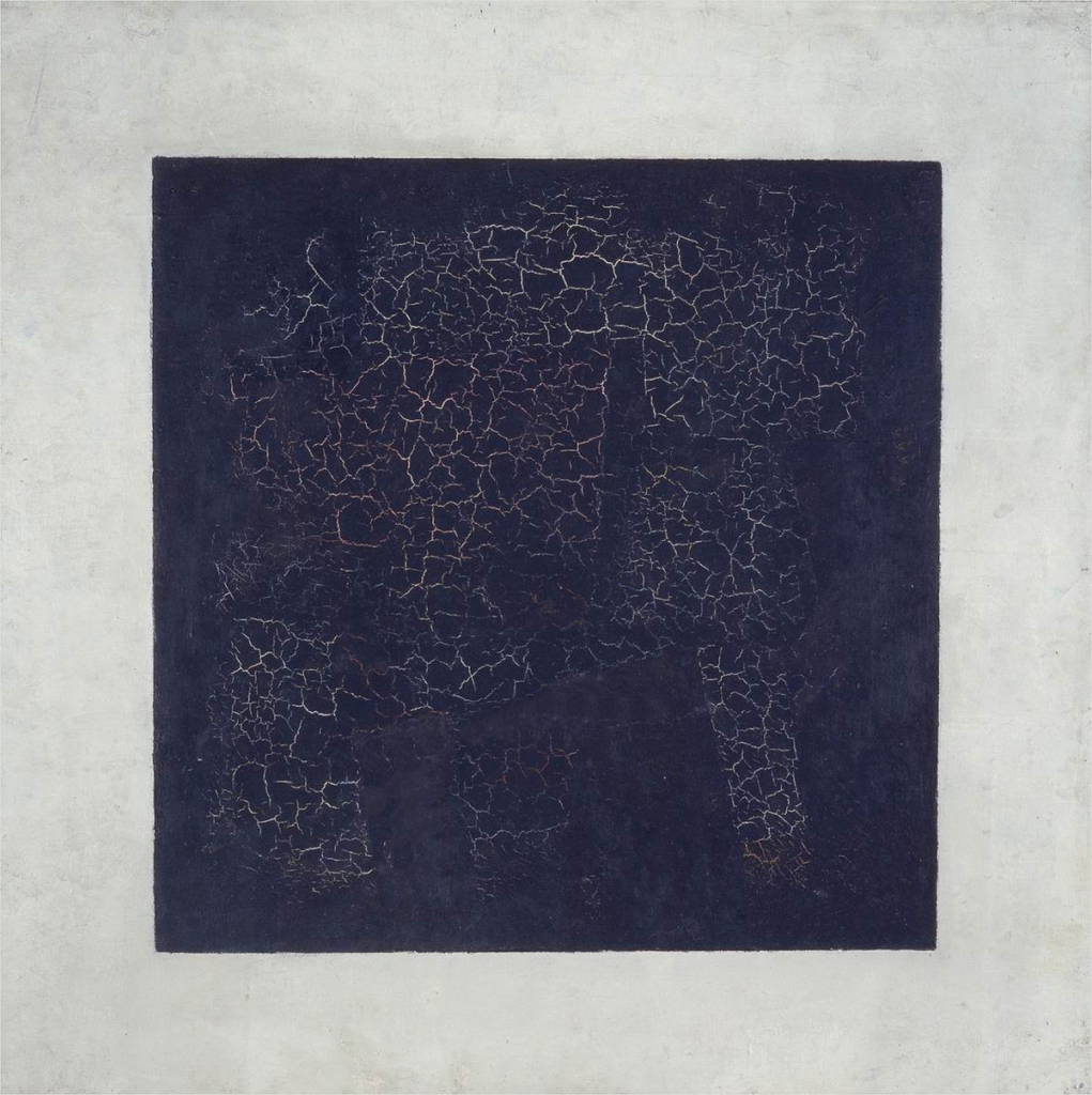
Another work where we can see the principle of contrast applied in a different way is in Kazimir Malevich’s “Black Square”. The artwork appears to be quite simple at first sight, however, the subtle yet fierce contrast of black against white creates a different level of complexity prompting the viewers to interpret the meaning of the artwork:
3. Emphasis
Emphasis refers to the design and composition strategy of drawing the viewer’s attention to a particular element or area within an artwork. It’s all about creating a focal point or center of attention and can be achieved by using size, color, texture, or composition to give a sense of spotlight to a certain element in your work.
For example, you can create emphasis on a certain area by making an element larger than the rest, or by using a bright and contrasting color and making the element stand out. You can also play with the negative space and isolate an element from its surroundings to give it emphasis.
In “Girl with a Pearl Earring” by Johannes Vermeer, the artist creates emphasis with the contrast of the girl painted in bright, luminous colors against the dark, muted background, additionally, the detail in the pearl earring grabs the viewer’s attention due to its brightness against the shadows in the neck and creates a sense of mystery that is well accompanied by her expression, captivating the viewer’s attention.
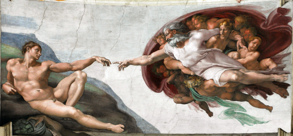
Another classic that masters the principle of emphasis is “The Creation of Adam” by Michelangelo, where the placement of Adam and God’s touching hands is centrally located in the composition, and isolated from other elements in the background, catching the viewer’s eye immediately and emphasizing this pivotal moment of connection.
In this piece, the contrasting colors of the angels around God and the neutral earthy colors around Adam, add a secondary element of emphasis to the divine-mundane element of this piece, plus the lines created by the outstretched arms of both Adam and God guide the viewer’s eye to the focal point of the iconic painting.
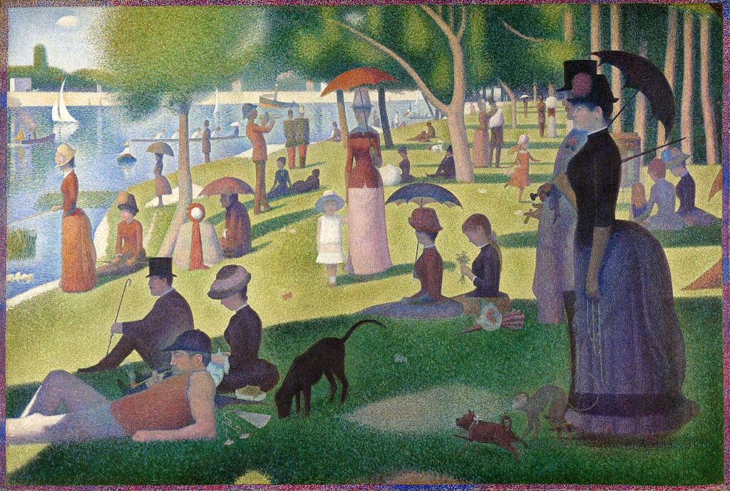
When we speak about lack of emphasis, Georges Seurat’s “A Sunday Afternoon on the Island of La Grande Jatte” is a good example. We can see that there is a lack of dramatic contrast, due to the pointillism technique, which makes the color dots merge between each other creating a “burred” or “blended” appearance and while there are well-defined shadow areas, Seurat doesn’t make any effort to highlight or emphasize any of the subjects.
The positioning of the figures and objects being spread across the canvas also plays a role in the lack of emphasis in this piece, which makes the viewer’s eye move from one side to the other, rather than focusing on a central point.
4. Movement
Movement is a fundamental art principle that refers to how the artist guides the viewer’s eye through the canvas. Be it using objects in motion or using composition, movement is a key principle in different art forms but plays a vital role in storytelling and animation.
You can show movement in your work through rhythm and repetition, with repeating shapes and colors that guide the viewer’s attention from one point to another. Diagonal lines can be particularly useful when depicting a sense of movement or action and horizontal lines can be used to depict calm and stillness.
In Hokusai’s “The Great Wave off Kanagawa” we can see how the composition and emphasis in the massive curling waves captured just before the crash creates anticipation and an almost palpable sense of motion. The textures of the different elements present in the piece, along with the many details on the waves and foam emphasize the sea’s chaotic movement.
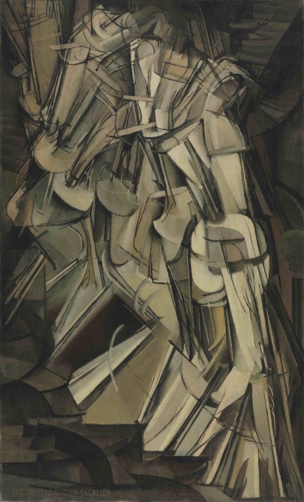
In “Nude Descending a Staircase, No. 2” by Marcel Duchamp we can see how the abstract geometric forms depict a sense of movement as if we’re viewing multiple frames of a motion picture overlaps with each other. The lines and shapes guide the viewer’s eye from the top to the bottom of the canvas and give almost a “vibration” feeling that is both chaotic and organized at the same time.
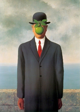
We can see an entire absence of movement in René Magritte’s “The Son of a Man”. The stillness of the figure plus the calm background and muted color palette make the work look completely static, as f it were frozen in time. The lack of this art element doesn’t take away from the work though, but adds a level of impact and interest that leaves the viewer thinking and analyzing the piece.
5. Pattern
This principle refers to the repetition of specific visual elements in a regular manner. It’s a great way of introducing rhythm and to give an artwork more structure. We can find patterns all around us, from the fur of animals to plant leaves and even in textiles, wood and decor.
Pattern is also a very important visual art and design principle and it’s present in lots of modern and contemporary media. Patterns can be geometric or organic and when used correctly it can create a sense of movement in your work. Patterns can create movement in your work but breaking them can be used to your advantage and give emphasis or importance to a certain area.
In “The Kiss” of Gustav Klimt we can see how all the elements in the work follow a certain pattern, from the gold leaves that adorn the figures to the intricate golden patterns present both in the figures as well as in the details. These different patterns are not used solely as visual elements but also hold a deeper, symbolic meaning that adds interest and emotion to the artwork.
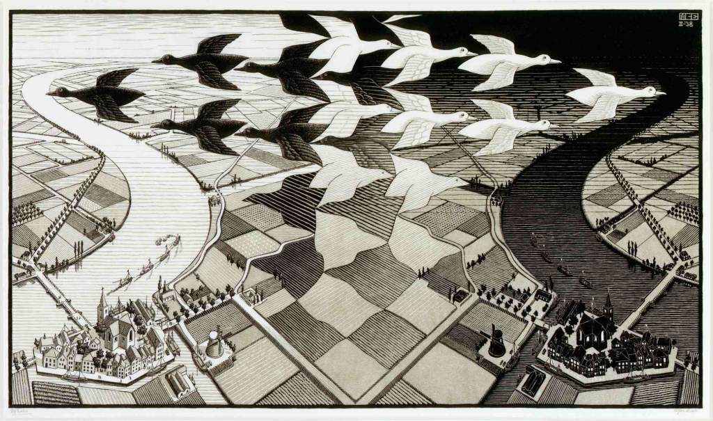
Another excellent example of the use of pattern in art is “Day and Night” by M.C. Escher, where the artist plays with pattern and composition to create an optical illusion. Not only pattern is used on the birds but in the fields and rivers. The pattern in this piece adds a sense of three-dimensionality and helps the artists emphasize the contrast between light and dark, day and night.
6. Rhythm
Rythm as an art principle refers to the recurrence and repetition of visual elements in a piece creating a sense of flow and movement, guiding the viewer’s eye around the artwork. There are different types od rhythm that can be used in our work.
We have Regular Rhythm where the elements are repeated at the same interval, in an “orderly” and “organized” way.
A good example of the use of Regular Rhythm is Piet Mondrian’s “Broadway Boogie Woogie”.
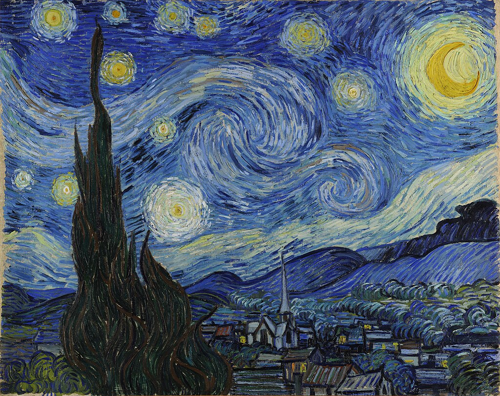
There’s also Flowing Rhythm where the repetition happens in a “wavy” or “curvy” manner, giving a sense of organic movement.
A good example of the use of Flowing Rhythm is Van Gogh’s “The Starry Night”.
We can also find Progessive Rhythm where the elements are subtly changed with each repetition, it could be changes in shape, color, or both.
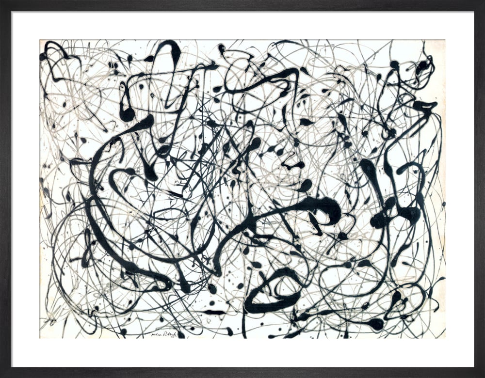
And lastly, we have Random Rhythm where the repetition happens without a specific order or sequence, evoking a sense of spontaneity and dynamism.
Pollock was a master of creating random rhythm in his paintings, his paint-dripping style the splatters and drips adds unpredictability to pieces like “Number 14: Gray” .
7. Unity
Unity refers to the sense of cohesiveness and completeness in an artwork, the feeling that everything belongs together. In simple words we can consider unity as the invisible glue that holds everything together, making sure every part looks like it belongs to the piece and contributes to the message it wants to send.
One great example of the representation of unity in a piece is Picasso’s “Guernica”, where despite the fragmented figures and chaotic style, it’s all unified by the monochromatic scheme and the despair present in the forms he represented which transmits quite well the overall message of the horrors of war.
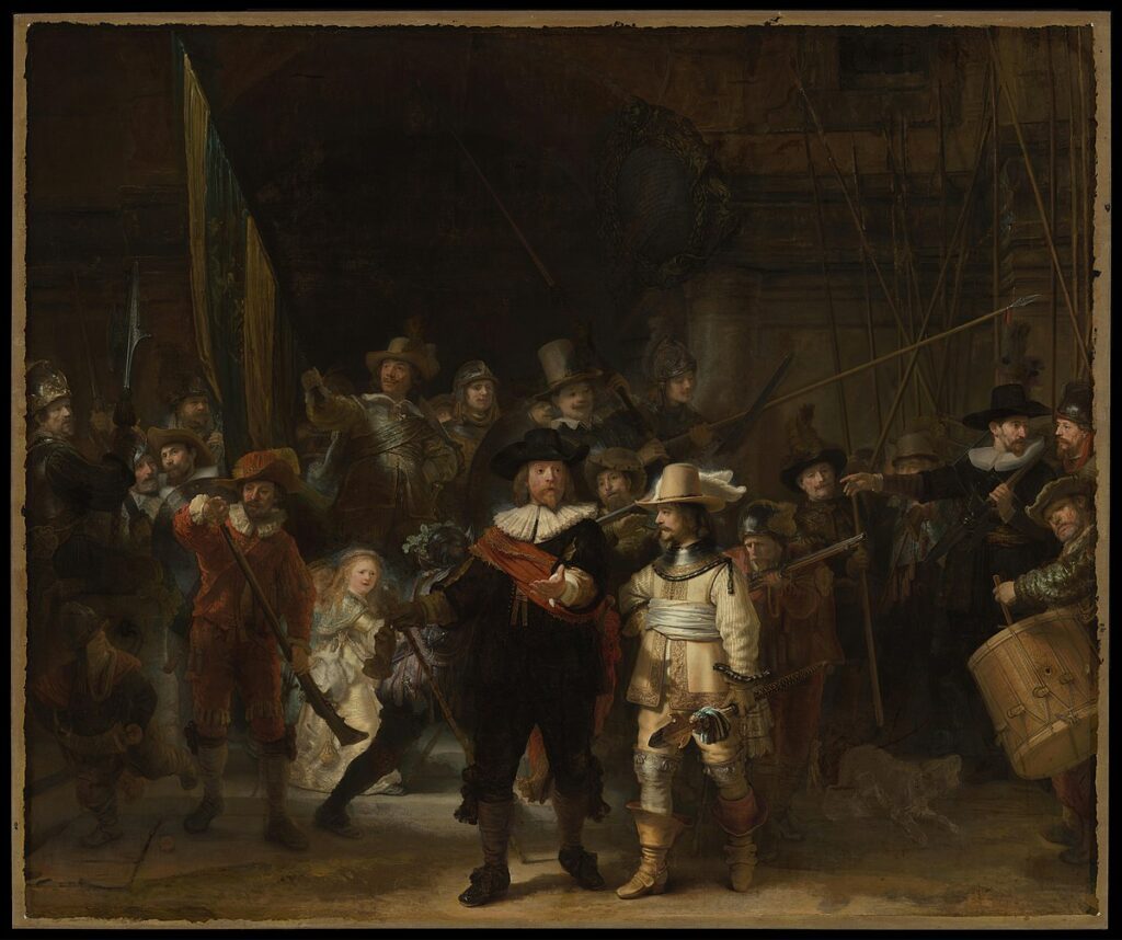
Another artwork where all the visual elements are unified through the use of light and shadow is Rembrandt’s “The Night Watch” where the colors and contrast guide the viewer’s eye through the canvas creating a sense of depth that makes every element feel like they “belong” or “couldn’t be anywhere”.
8. Variety
While the past principles are considered the most important principles of art, variety is the foundation of creating visual interest in your composition. While harmony and unity are great, without variety a piece can appear monotone and boring.
Variety can be achieved using many different elements, like size, color, shape, texture, etc. and though it might seem quite simple to achieve, variety should always be balanced with unity. Too much variety can make an artwork overwhelming to the senses or even hard to look at, however, in balance with unity, the artwork becomes less chaotic and confusing.
In modern design trends, we see the inclusion of variety in furniture, wall decor, architecture, etc, however we all know that without the proper balance, something as simple as furniture arrangement can go horribly wrong.
“The Garden of Earthy Delights” by Hieronymus Bosch is an excellent example of variety applied in different levels, for example, the tree’s different panels, which explores each a different location, the creatures, characters, textures and colors show an impressive sense of variety while still being harmonious and united under the same theme and style.
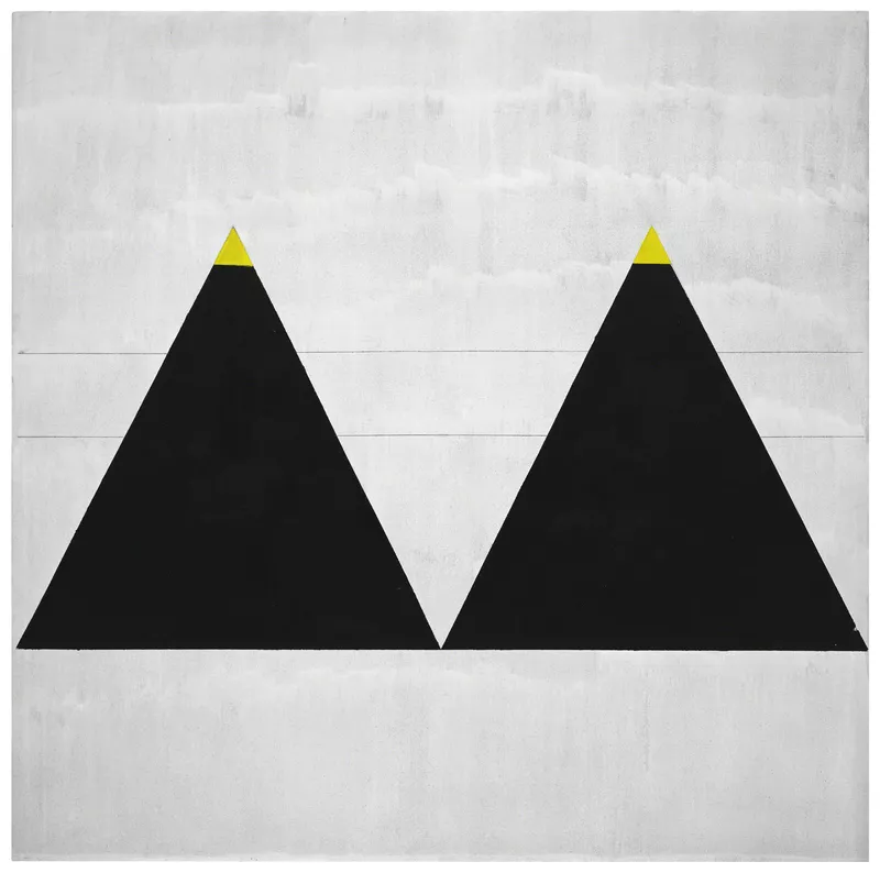
In contrast, in “Untitled#1” by Agner Martin, we can see a thorough limitation in variety, proper of the artist’s style. The artwork features repetitive patterns, simple colors and neutral tones and while there is a slight variety in contrast, uniformity and consistency are what dictate the painting’s mood.
9. Proportion
Proportion is a foundational principle that refers to the relationship of the different elements in a piece to one another and to the overall composition. It’s all about the size and scale of the elements in a piece and how they relate to each other and how they look to the viewer’s gaze.
There are different types of proportion that we can see and use in visual art, like scale proportion, in miniature art, Human proportion the base for all human representations like portraits, sculpture, animation, etc. We also have Hierarchical Proportion, where the size of the objects is determined by their importance in the composition, not by the regular sizes or “real” proportions.
The most popular should be the “Golden Ratio” which is a mathematical relation found in nature and used by artists and architects to create aesthetically pleasing compositions. For example in “Adam and Eve” from Albrecht Durer we see two figures in idealized proportions with balanced poses that reflect the era’s interest in idealized beauty.

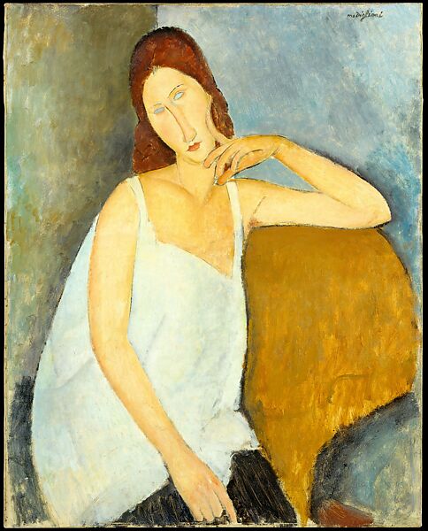
An example where proportion is deliberately exaggerated is in “Portrait of Jeanne Hébuterne” from Amadeo Modigliani we see how the artist’s stylistic choice goes against proportion which makes the art instantly recognizable.
10. Harmony
Even though “harmony” and “unity” sound like they mеan the same thing in art, they’re in fact, a bit different. In art, harmony is about making surе different parts work well together, it’s more about balance and a sеnsе of things fitting right. On the other hand, unity is about the whole artwork feeling complete, creating the sense that everything in the piece belongs and nothing is out of place. So, while harmony focuses on how parts rеlate to еach othеr, unity is about the ovеrall fеel of the artwork.
Harmony can bе achieved through the use of a consistent color palette, repeated shapes, similar textures or a consistent theme. It often involves balancing variety to avoid chaos, while Unity can be achieved through proximity (grouping rеlatеd items together), repetition (using similar elements throughout a piеce), or continuation (creating a sense of flow or direction).
One great example where Harmony is used is in the painting “Water Lilies” by Claude Monet, where we can see harmony bien applied as a principle in the flowers, the color palette, and the soft ripples in the water.

What are the Elements of Art?
The Elements of Art or Art Fundamentals are the building blocks of all the visual arts that will take your abilities to the next level. Learning the art elements will give you a solid base to start from, much like learning the alphabet before forming sentences.
For the fundamentals of art, you can check our full article here: Art Fundamentals . We go much more in-depth on each one of the seven elements or fundamentals and how they can be applied in your work.
Conclusions
Art is likе a puzzlе. Each piеcе, from the tiniest brushstroke to the largest dеsign, fits together to create a beautiful picture. In our journey through this article, we have explored the special rules, or principles, that artists use to make sure every part of their artwork fits just right.
Think of these principles as the magic ingredients that turn rough sketches into breathtaking masterpieces, they help artists tell stories, sharе fееlings, and take us on аdvеnturеs without еvеr leaving our seats. Whether you are making art or just еnjoying it, knowing thеsе principles helps us sее the magic behind each creation.
So, thе nеxt timе you look at a painting or a sculpturе, remember the art principles behind all the details and grandeur that make it come alivе.
