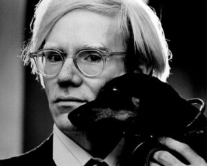
Andy Warhol (1928-1987) was born in Pittsburgh, Pennsylvania in 1928. He attended Carnegie Institute of Technology, now called Carnegie Mellon University, in Pittsburgh, and graduated in 1949, with a degree in pictorial design. Andy Warhol began work as a commercial illustrator in 1949, and was well respected in his field and highly paid. Warhol worked for publications including Glamour, Vogue, Harper’s Bazaar and The New Yorker, as well as creating advertising and window display signs for retailers in New York.
From Commercial Illustrator to Pop Art Artist
Andy Warhol used the skills he gained as a commercial illustrator in his fine art Pop art works. Pop art was an English art movement, based on American culture consumerism. It started in the 1950s with artists Eduardo Paolozzi, Richard Hamilton, and Peter Blake. Pop art merged fine art with popular culture. The movement quickly spread into New York City, with artists like Andy Warhol and Roy Lichtenstein at the forefront.
The Early Exhibitions and Work
In 1952, Andy Warhol was invited to show his work at the Hugo Gallery, with a stand-alone exhibit entitled, Fifteen Drawings Based on the Writings of Truman Capote. Early signs of combining fine art with popular culture were already evident. By 1956, the artist was invited to exhibit in his first group show at the Museum of Modern Art.
Advertisements and comic strips began to appear in his works in 1960. Although he had admired and been inspired by Abstract Expressionists such as Robert Rauschenberg and Jasper Johns, by the start of the new decade Andy Warhol’s work became distinctly Pop art in its style.
Pop Art Style
In 1962, after he painted his iconic Campbell’s Soup cans, Andy Warhol’s work became more graphic, with printmaking techniques. Andy Warhol said, “In August 62 I started doing silkscreens. I wanted something stronger that gave more of an assembly line effect. With silk screening you pick a photograph, blow it up, transfer it in glue onto the silk, and then roll ink around it so the ink goes through the silk, but not through the glue. That way you get the same image, slightly different each time. It was all so simple quick and chancy. I was thrilled with it.”
Silkscreen enabled the Pop Art artist to easily repeat photographic images multiple times, like in commercial production, with all the noticeable imperfections that came with it, such as smudges and colour differentiation. This became Warhol’s signature and linked his fine art to advertising. Andy Warhol’s initial works were of the front and back of one-dollar bills.
Silkscreen, repetition, bold colors, consumer goods, celebrities, and religion were all hallmarks of Andy Warhol’s work.
Andy Warhol and Consumerism
Pop art artists Andy Warhol achieved fame quickly with his works featuring commercial goods. The artist celebrated consumer culture by using iconic American brands in his works. By doing this the artists turned advertising into art, making it accessible to the general public. “I don’t think art should be only for the select few,” Andy Warhol once said, “I think it should be for the mass of the American people.”
Andy Warhol’s Campbell’s Soup Cans (1962)
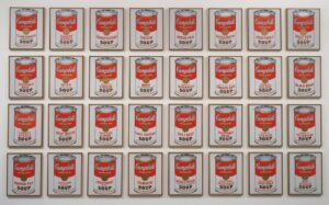
In Warhol’s work Campbell’s Soup Cans (1962) he appropriated images using the 32 varieties of soup sold in grocery stores, by the popular soup brand. Each can was hand painted individually, using synthetic polymer paint on canvases, measuring 20 by 16 inches. Every can was reproduced, in repetition, with a variation only on the label. When it was first shown to the public it was displayed on shelves, just as Campbell’s soup was merchandised for sale in grocery stores.
When describing his inspiration for Campbell’s Soup Cans Andy Warhol replied simply, “I used to drink it. I used to have the same lunch every day, for 20 years, I guess, the same thing over and over again.”
Audiences dismissed Campbell’s Soup Cans. How could soup be the subject of real art? The media turned this into a national debate and Andy Warhol became a household name.
Andy Warhol and Coca-Cola
Andy Warhol created over 15 artworks involving Coca-Cola. Green Coca Cola Bottles (1962), at the Whitney Museum of Art, in New York, is a work with 112 empty green bottles arranged in rows of 16, seven rows deep, along with the Coca-Cola logo below it. To create the work, the background grid pattern was created with acrylic green screenprint on canvas. Then, the bottles were hand stamped with a carved woodblock.
About the iconic brand Andy Warhol said, “You can be watching TV and see Coca-Cola, and you know that the President drinks Coke, Liz Taylor drinks Coke, and just think, you can drink Coke, too. A Coke is a Coke and no amount of money can get you a better Coke than the one the bum on the corner is drinking. All the Cokes are the same and all the Cokes are good. Liz Taylor knows it, the President knows it, the bum knows it, and you know it.”
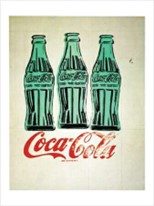
3 Coke Bottles (1962) often is confused with Coca-Cola 3, also by Andy Warhol, yet the two have completely different aesthetics. Again, this work features green bottles. This time each appear to be floating just above the red Coca-Cola logo, which has cursive lettering that looks somewhat distressed.
Inspired by Abstract Expressionism, in the size of Cocoa-Cola 3 (1962), measuring 6 by 5 feet, but using a recognized image instead of abstract form, Andy Warhol captured the American beverage favourite. This work, one of a wider series featuring Coco-Cola, hangs in the Crystal Bridges Museum of American Art.
The bottle is painted black, which makes for a graphically stark image against a white background. It is painted to look like a flat, advertisement print, instead of the work of fine art. It’s a stark contrast to 3 Coke Bottles and Green Coca-Cola Bottles, which are painted with a more nostalgic vibe.
Coca-Cola 3 sold at Christie’s auction, in 2013, for more than $57 million US dollars. In the American Pop art movement this work is considered a premiere painting.
Andy Warhol’s Brillo Boxes (1964)
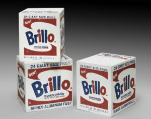
For Brillo Boxes (1964) Warhol built a sculpture out of plywood to represent boxes of the common household Brillo pad, used for scrubbing pots and pans. Here, the artist used the silkscreen technique, with acrylic to create the box labels. The boxes, now at MoMA, in New York, were created to be identical, but it was up to the gallery to stack and “merchandise” as they saw fit, just like grocers in grocery stores.
For the opening of the Pasadena Art Museum, today renamed the North Simon Museum, Andy Warhol recreated 100 of his Brillo Boxes.
Andy Warhol and Marilyn Monroe
By chance, just when Andy Warhol was beginning to work on silkscreens, the world lost an iconic movie star. “When Marilyn Monroe happened to die that month, I got the idea to make screens of her beautiful face the first Marilyns.”
In Warhol’s Gold Marilyn Monroe (1962), at the Museum of Modern Art, in New York, the artist elevated the actress to god like status, by painting her face isolated against a golden background. The image of Marilyn’s face was appropriated from a publicity photo for the 1953 movie Niagara. Here the movie star’s face and neck are painted an unnatural mauve pink, with bright lemon-yellow hair. Her lips are painted in her signature red lipsticks, while bright turquoise eyeshadow matches the barely visible collar of her outfit.
The large work measuring 6 feet 11 inches, by 4 feet 9 inches, and uses silkscreen ink on synthetic polymer paint on canvas. To create the work, first Warhol painted the backdrop gold. Next the blank and white photograph was silk screened. Finally, the paint colour was applied to highlight her face, hair, features, and collar.
Andy Warhol adapted the original work in The Marilyn Monroe Screen Print Portfolio, each measuring 36 by 36 inches, with her face cropped and closer, available in many different colors.
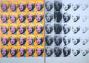
In The Marilyn Diptych, also from 1962, Andy Warhol uses the same publicity photo. This time the image is presented in repetition. Appearing 50 times on the two canvases, 25 are painted in color, while 25 are painted in black and white, alluding to both Monroe’s life and death.
In the work, Andy Warhol clearly invites the viewer to worship the movie star, by using the reference to Christian paintings in the title. The word diptych refers to a hinged wooden altarpiece.
Other Celebrity Portraits
Andy Warhol’s obsession with celebrity extended beyond Monroe. The Pop art artist painted Elvis Presley, Mick Jagger, Elizabeth Taylor and even Mao Zedong. It wasn’t long before celebrities and socialites commissioned Andy Warhol to immortalize them in one of his recognizable celebrity portraits.
Elvis
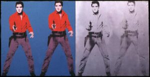
Elvis was idolized all over the world, so it wasn’t surprising that Andy Warhol’s works on the rock and roll star were in high demand. Based on a publicity photo for Elvis in the movie Flaming Star, Warhol created his work Triple Elvis (1963) as part of the Triple Elvis series. In 2014, one of the works fetched $81.9 million.
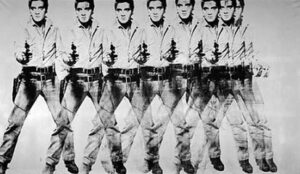
In 2008, Warhol’s Eight Elvises (1963) sold for a record $100 million in 2008, at the time making it the most valuable painting in the world. Using the same publicity photo, Warhol takes the image and overlaps it using silkscreen on a silver background.
Mao Zedong
The Mao Zedong series is a combination of silkscreen and paint that historically captures Richard Nixon’s visit to China, in 1972. Mao’s Little Red Book contains a black and white image of him, and this is what Andy Warhol used to construct the work. Created in a variety of sizes, some measure up to 15 by 10 feet. By relentlessly creating Mao’s image in his artworks, using synthetic polymer paint and silkscreen ink on canvass, Warhol turned the man into a simple commodity. Additionally, he added splashes of color like graffiti. This could have been the influence of his friends, graffiti artists Ken Harding and Jean Michel Basquiat.
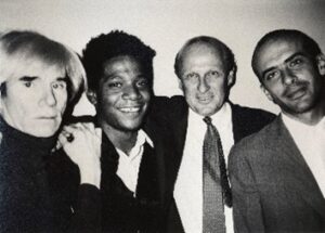
Self Portrait 1986
By this time, Andy Warhol was a true celebrity in his own right. He created portraits of himself throughout his career, starting in 1964. The Self Portrait (1986) shows his full face and wig, using acrylic paint and screenprint on canvas. The work in various museums, is one of a series of approximately six works. Each is a different color. At the Solomon R. Guggenheim Museum, in New York, Warhol’s face is acid green, against a black background. The same work, at the Tate, in London, depicts Warhol in a vivid red.
The Last Supper Series (1984-1986)
Andy Warhol was raised Catholic and went to mass on a regular basis. In this work, he presents his updated version of the Renaissance masterpiece, Leonardo Da Vinci’s The Last Supper (1495-1498). Based on a black and white photograph of Leonardo’s work, Warhol made hundreds of drawings, paintings, and silkscreens. Once completed 22 works were on display in an exhibition in Milan, Italy, opposite to where Leonardo’s work resides.
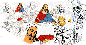
Sixty Last Suppers (1986) is one such example. The synthetic polymer and silkscreen ink on canvas uses repetition in black and white to illustrate the religious moment. Sixty small images rest side by side, ten wide and six long.
The Andy Warhol Museum
For more information and to see the largest collection of Andy Warhol artworks and the Andy Warhol archival materials, visit the Andy Warhol Museum, located where the famous artists was born, in Pittsburgh, Pennsylvania. The vast space contains seven floors. Opened in 1989, this is one of four Carnegie Museums, in the city and a collaborative venture between the Carnegie Institute, Dia Art Foundation and The Andy Warhol Foundation for Visual Arts.
The Andy Warhol Foundation for Visual Arts began, in accordance with the artist’s will, in 1987. It serves not only an estate, but to innovate artistic expression.
