20 Character Concept Art Ideas for Inspiration
Every piece of media entertainment is on its core a story. And every story that exists revolves around one or several characters, bringing those characters to life, is not only limited to describing their facial features, height, or body types, is all about taking every piece of information and translating it into elements and characteristics that make them unique.
And that is the work of a character concept artist, using every piece of information available to create a solid design that tells a story on its own.
Using cultural, environmental, social, and technological elements, every character is carefully crafted to fulfill a role in the series, movie, or game it was designed for, and to interact with its surroundings and other characters as well.
- Purpose of Character Concept Art
- Character concept art focuses on creating unique designs that convey a story, personality, and role in a narrative.
- Designers use elements like culture, environment, technology, and social influences to craft characters that interact with their world seamlessly.
- Key Features of Effective Character Designs
- Shape Language: Defines a character’s personality and energy through silhouettes and proportions.
- Storytelling: Visual elements like clothing, accessories, and textures tell a story or reveal the character’s background.
- Emotions and Roles: Strong designs evoke emotions and clearly define the character’s role in the narrative.
- Popular Techniques and Inspirations
- Cultural and Environmental Influences: Elements like patterns, symbols, and colors root characters in specific worlds (e.g., “Summer Fly” by Amber Ye).
- Texturing and Detailing: Techniques like blurring, rough painting, or intricate rendering guide viewer attention (e.g., “Lorima” by Plume Yu).
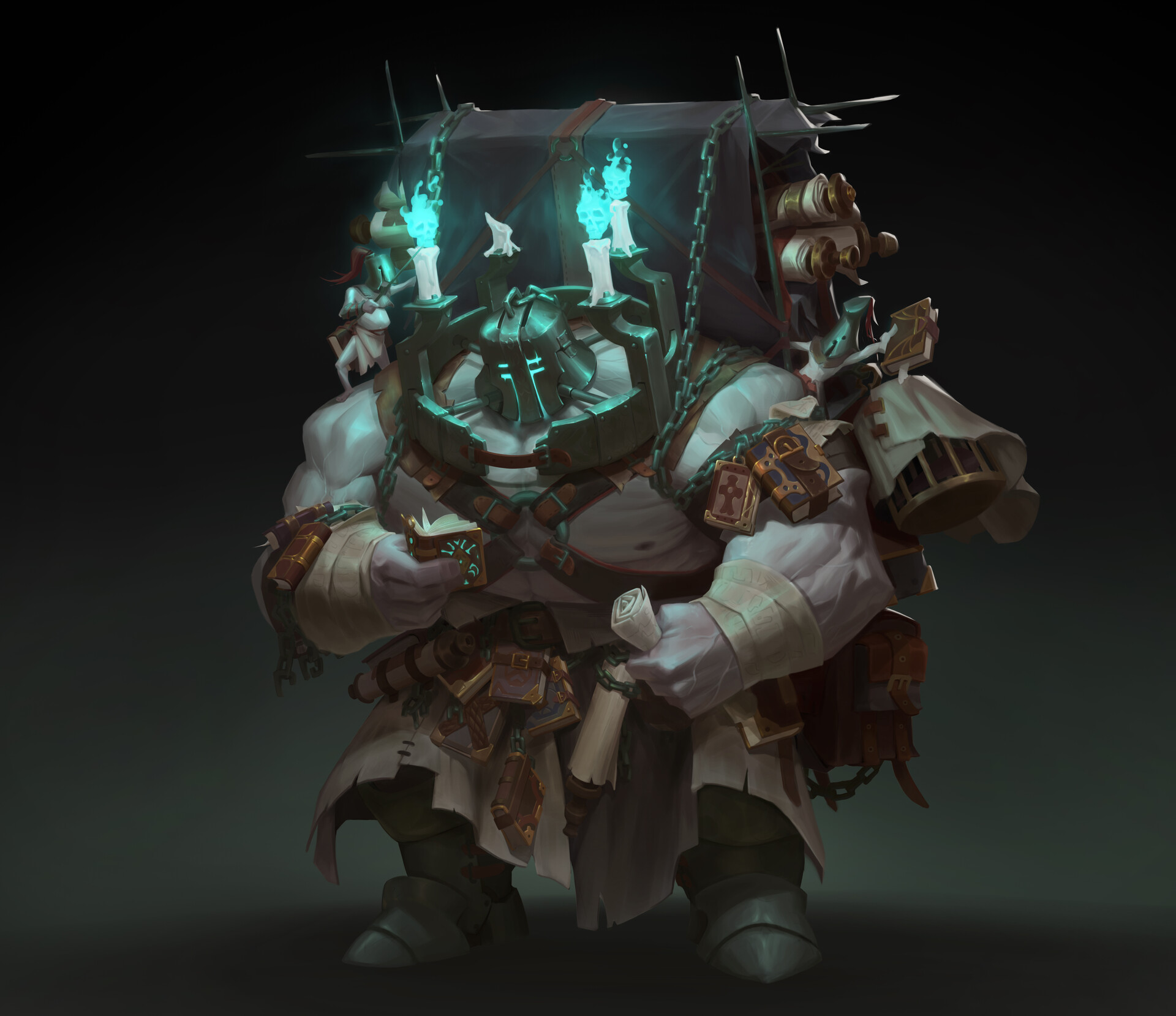
- Lighting and Contrast: Strategic use of muted palettes vs. vibrant highlights for mood setting (“Knowledge Guard” by H. Pimento).
- Noteworthy Examples and Applications
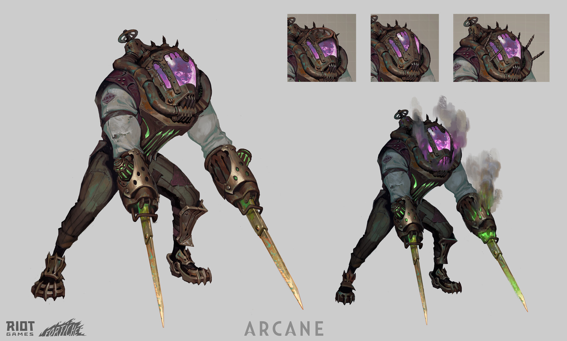
- Video Game Designs: Examples like Arcane and Total War: Warhammer III showcase detailed explorations of characters’ emotions, abilities, and accessories.
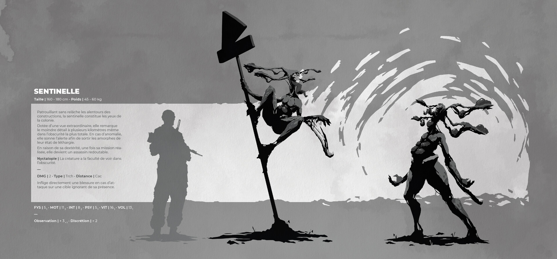
- Cinematic and Post-Apocalyptic Themes: Pieces such as “Sentinelle: Inkorporate” utilize high contrast and bold shapes for impactful designs.
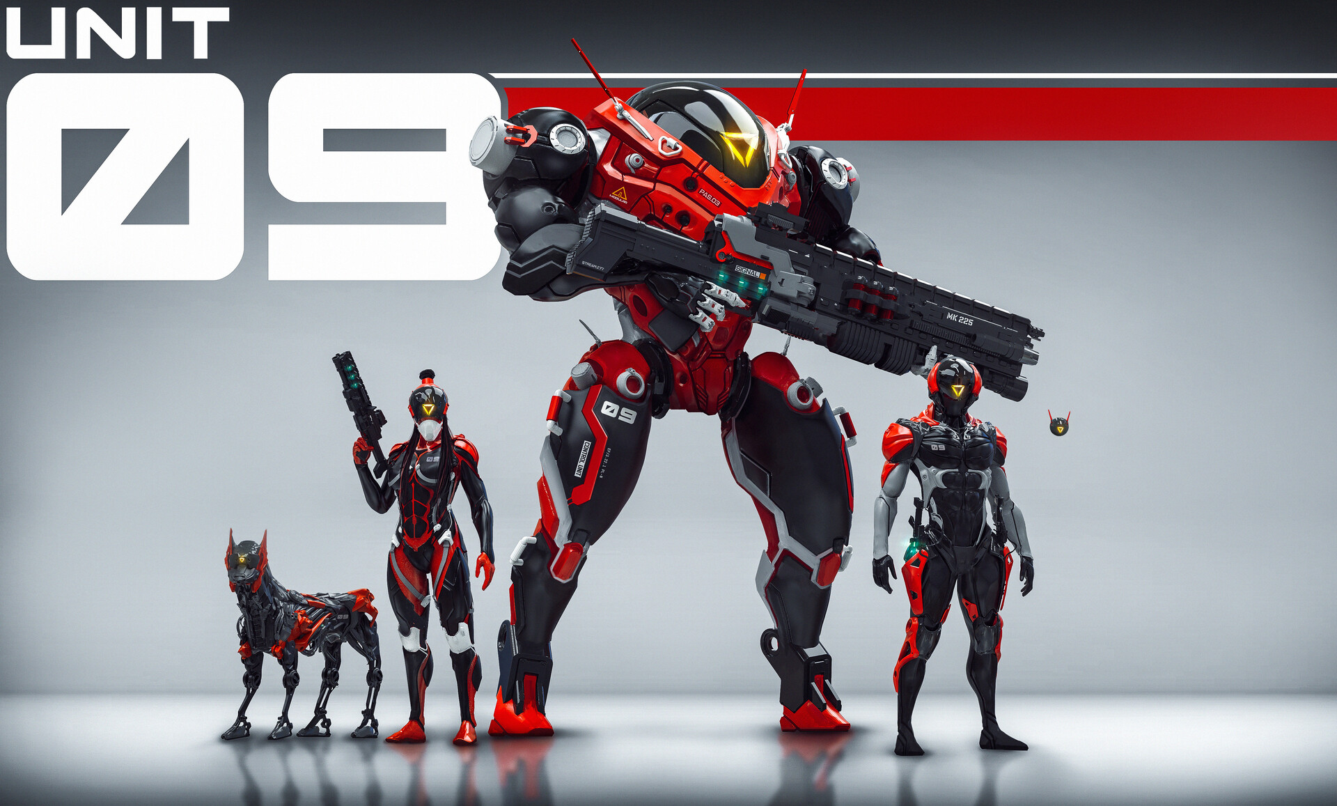
- Fantasy and Sci-Fi Creations: Art like “Unit 09” and “Guardian of the Stone Forest” blends futuristic and fantastical elements.
- Concept Art Processes
- Begin with design exploration (shapes, color palettes, and textures).
- Refine ideas through iterations to harmonize elements with the story’s tone and universe.
- Integrate visual storytelling by focusing on emotive and functional design features.
- Importance of Iteration and Experimentation
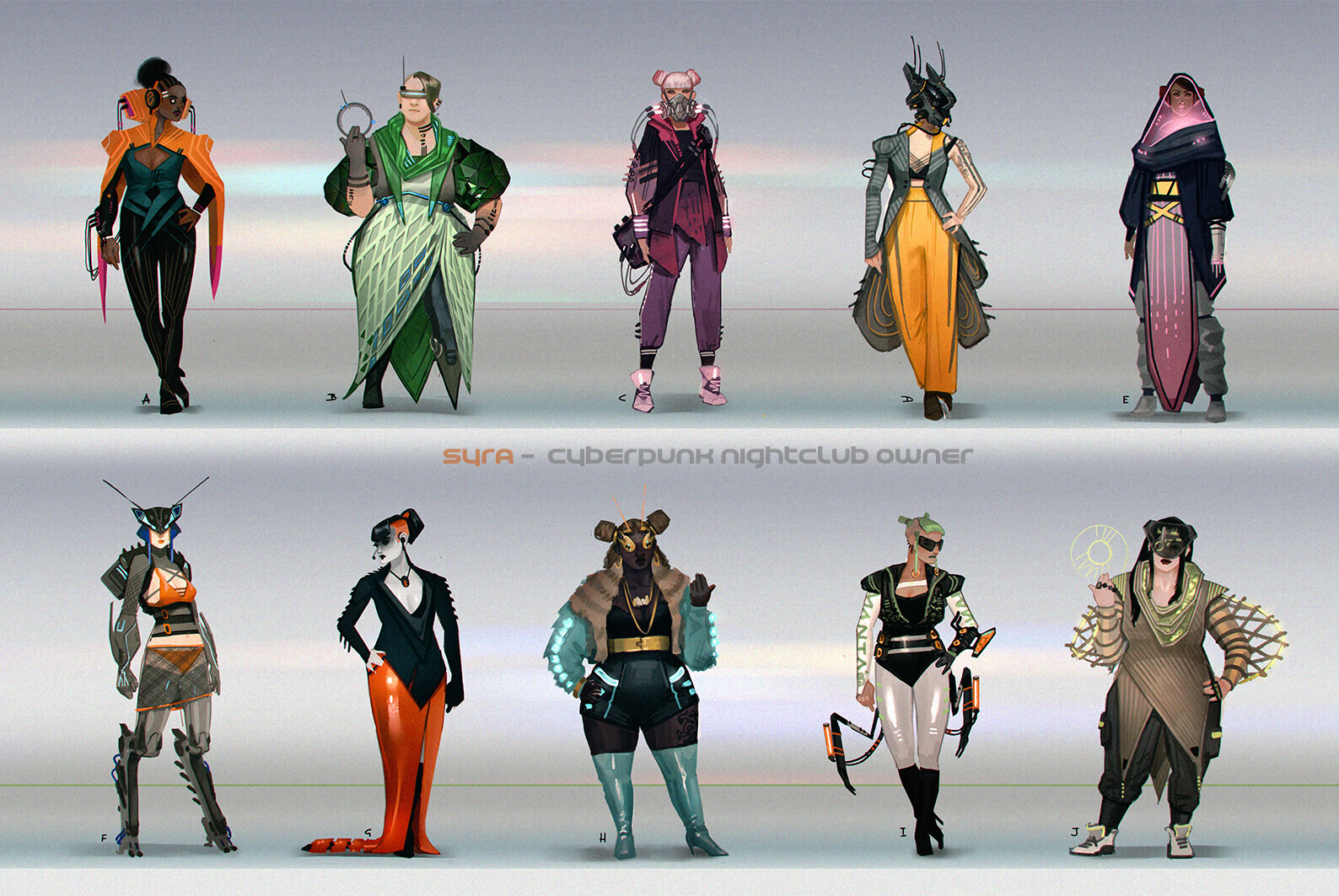
- Iterative design processes (e.g., Syra by Sam Hoggs) emphasize testing different styles, shapes, and accessories before settling on the final version.
- Experimentation enhances creativity and ensures designs align with the universe and narrative.
Conclusion
Character concept art is an essential aspect of storytelling in video games, films, and other visual media. Successful designs rely on thoughtful storytelling, cultural influences, and experimentation to create characters that are both visually stunning and narratively compelling. This process bridges the gap between imagination and reality, crafting personalities that resonate with audiences worldwide.
In this gallery we’ve gathered some of what we consider the best and most inspiring works of character concept art, we hope you can find references, inspiration, and grow as a concept artist!
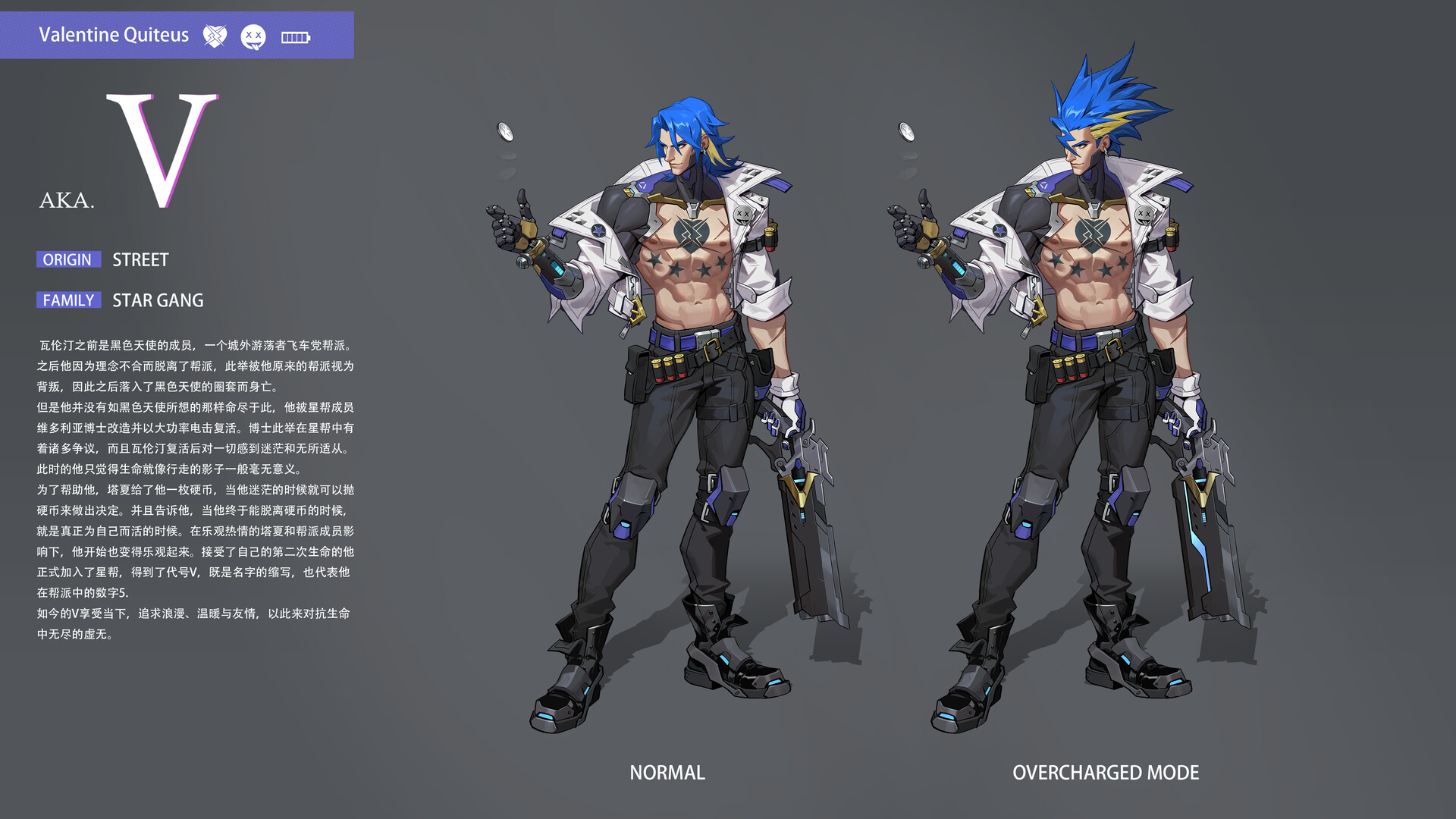
V Character Design — Yi Zhang
This amazing design doesn’t only define the personality and style of the character but if we go to the artist page we’ll see a complete exploration of design, abilities, emotions, and weapons giving to the viewer a complete visual experience.
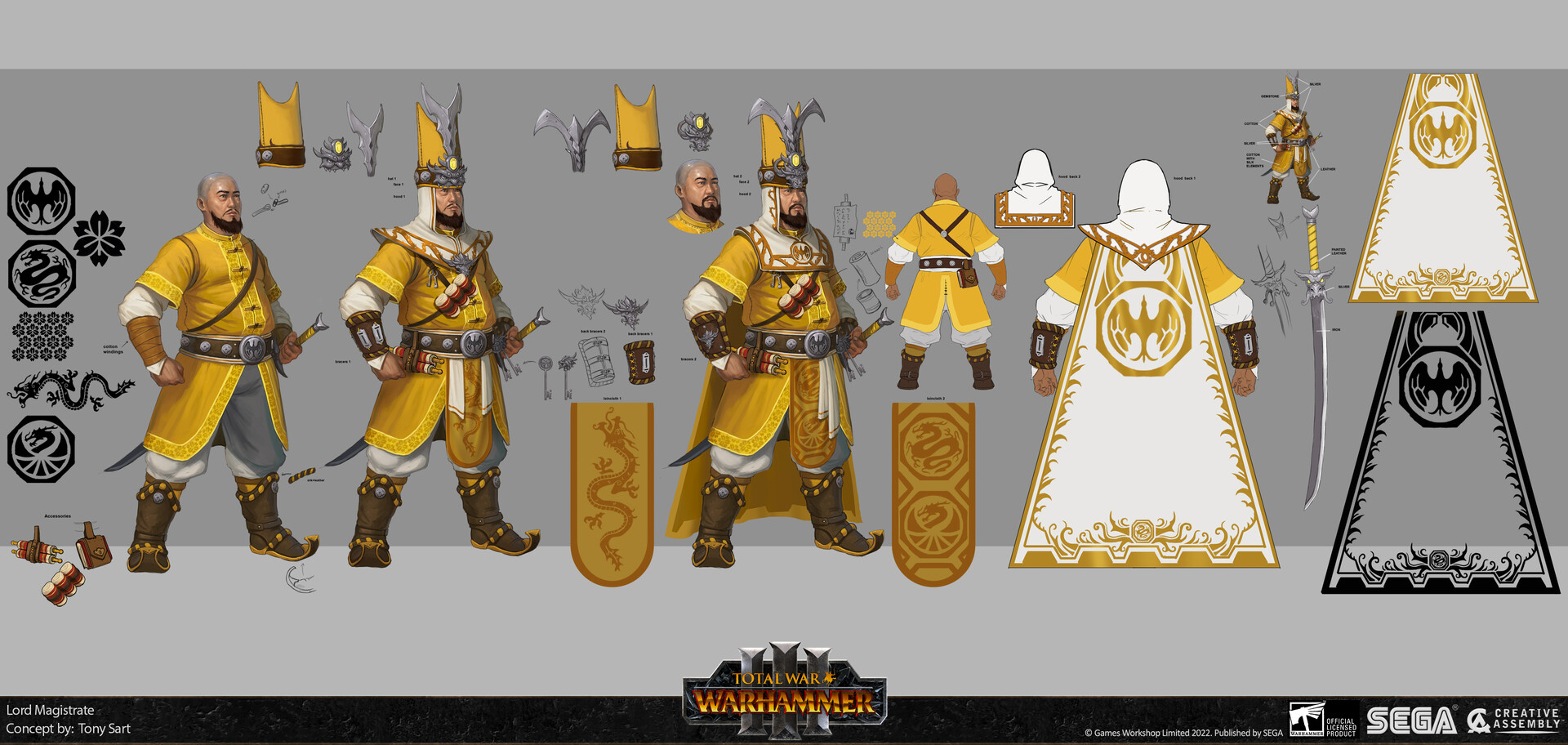
Total War: Warhammer III — Tony Sart
In this piece we can see the full development of one of Warhammer’s characters, we can see every element that was considered in the clothing design. The patterns and accessories are carefully considered giving a complete notion of this character’s position and personality.
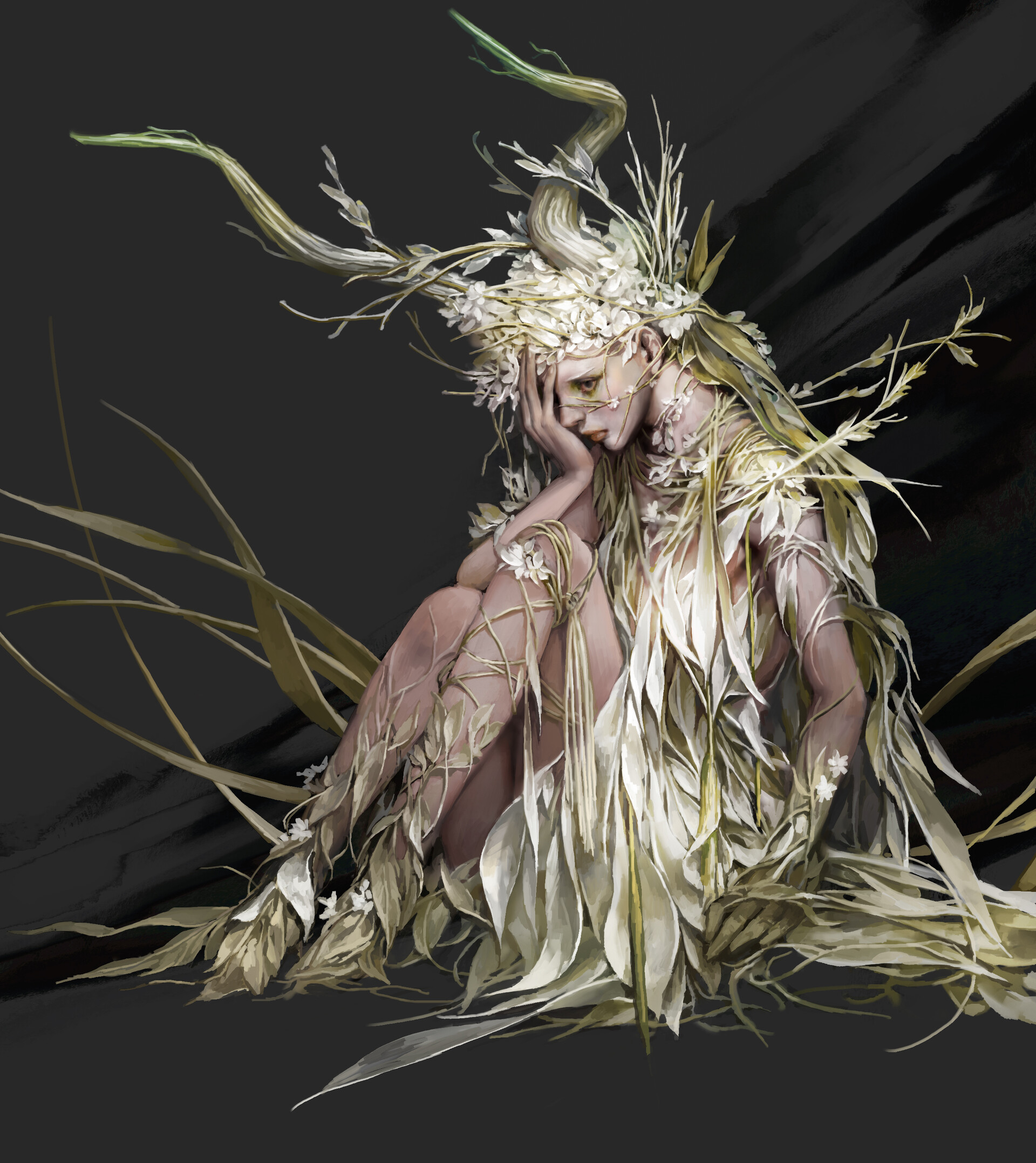
Nymph — Mam BA
Here we have an amazing piece where though there is not a clear exploration of the character, the message is quite clear and that is one of the most important matters in concept art, transmitting emotions and stories with just a piece of art. Great work!
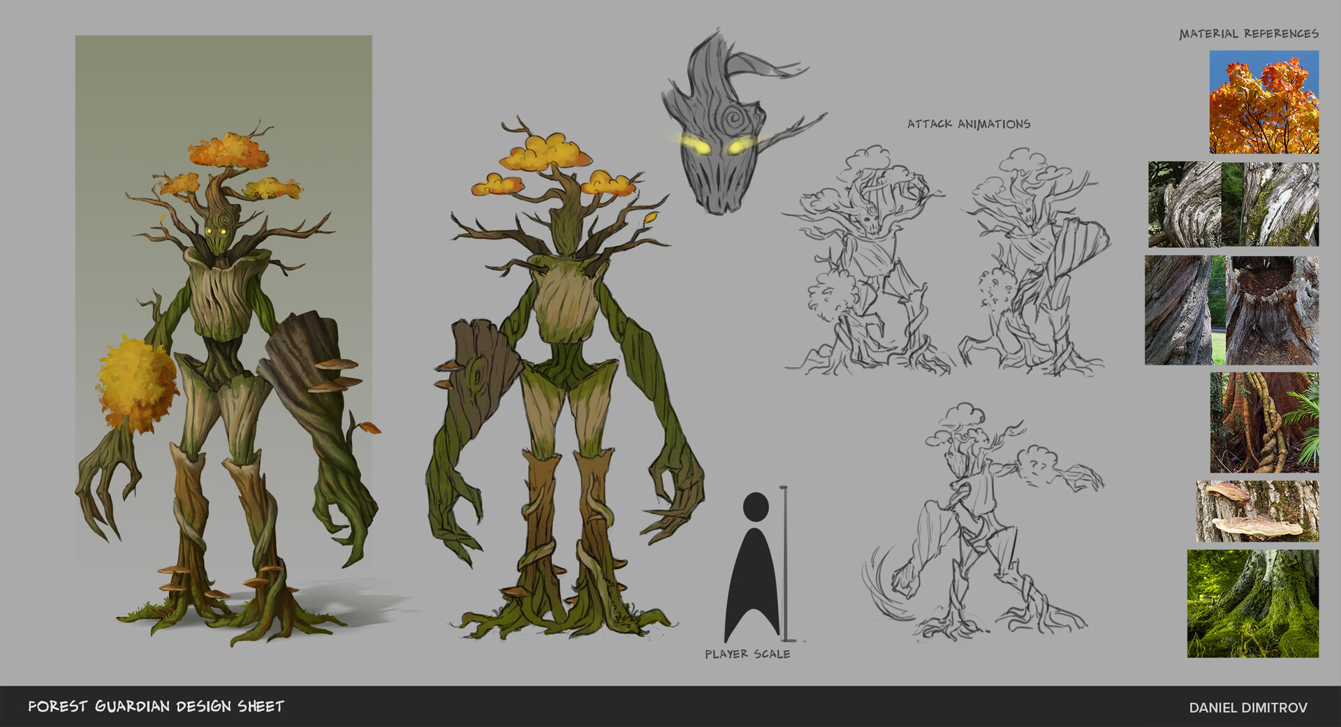
Forest Guardian — Daniel Dimitrov
Even though this piece is not the final render of the concept, this was the sheet that portrayed the best how the artist designed and used multiple nature elements for this character. The style is set and on the artist page, we can appreciate the effect the season has on this character as well as some early sketches.
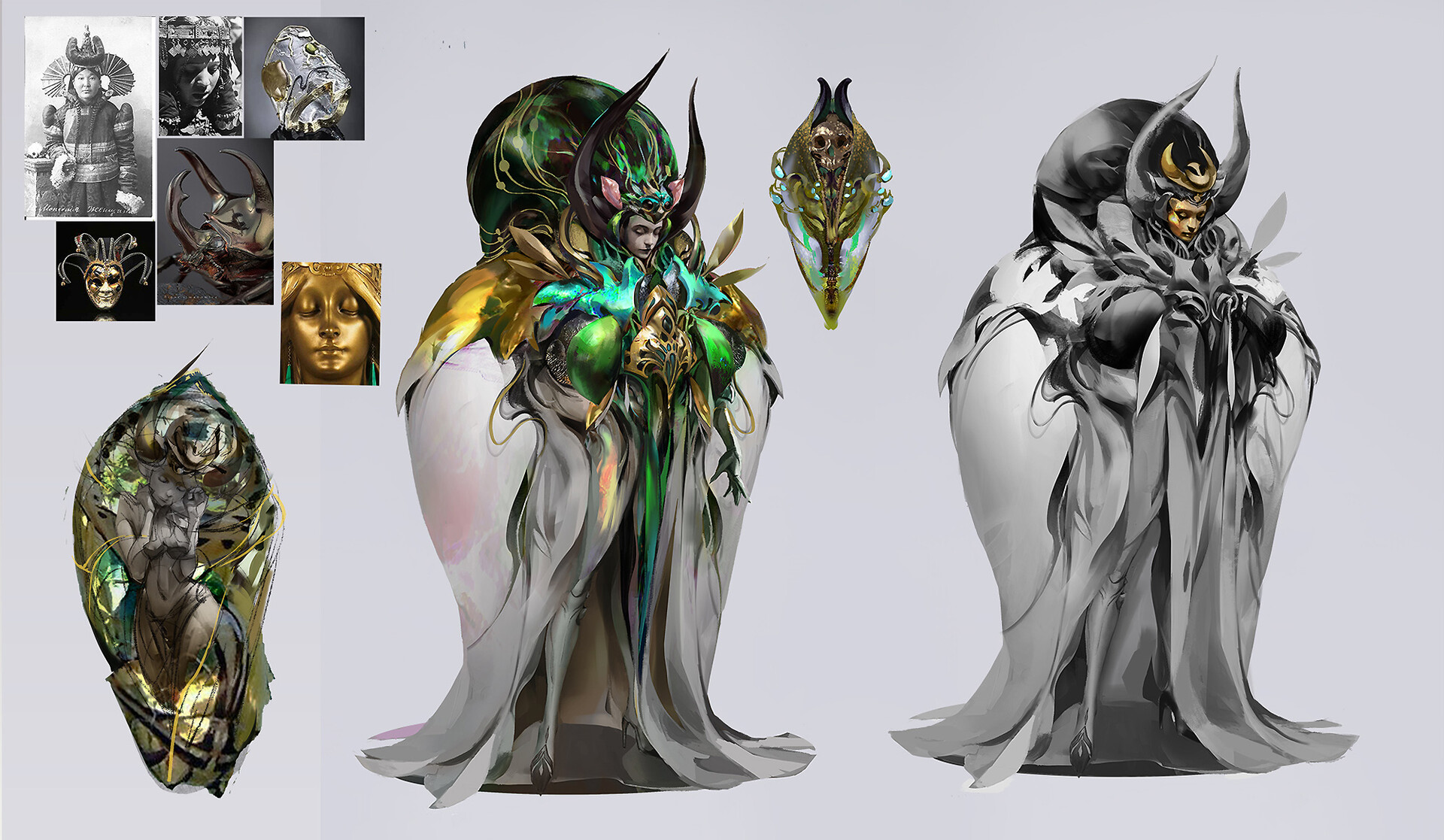
Summer fly — Amber Ye
This piece does wonders combining the reference cultural elements with the character inspiration, the shape language might not seem too impressive but delivers a strong message and the contrast between muted tones and bright greens and goldens make it more than visually appealing.
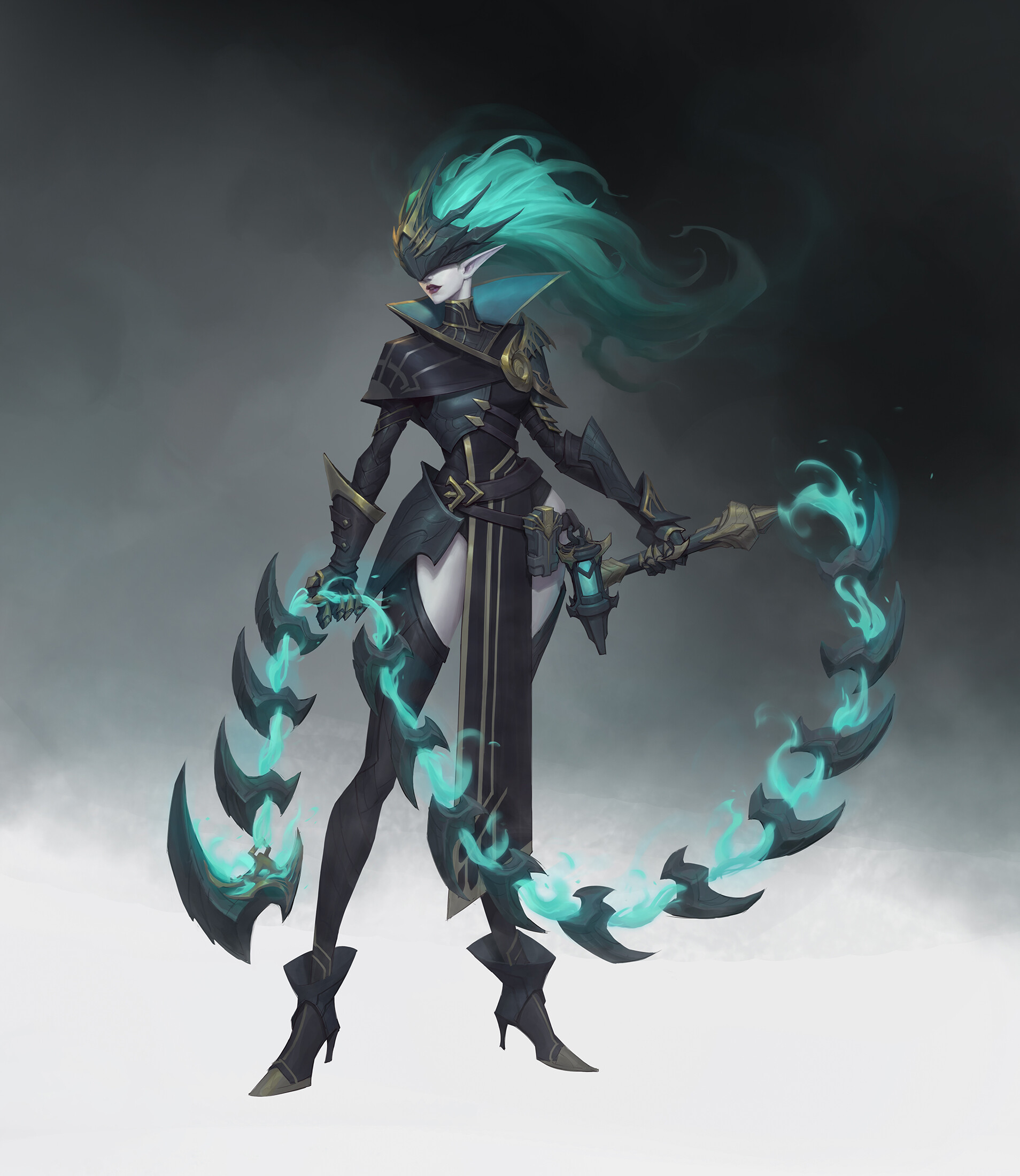
Lorima — Plume Yu
In this piece, we can appreciate how the artist’s brushwork technique integrates with the character making the blurred smokey shapes a visual key of the design. The combination between simple shapes and detailed render focuses the viewer’s attention on the armor and body of Lorimas, and the shape language of the body gives a very powerful vibe.
Knowledge Guard — H Pimento
The first thing that seems to grab our attention when looking at this piece is the lightning, working with a muted color in contrast with the bright teal candle light makes us focus on the surrounding elements that seem to tell a story of their own. Great execution not only regarding illustration and design but also storytelling.
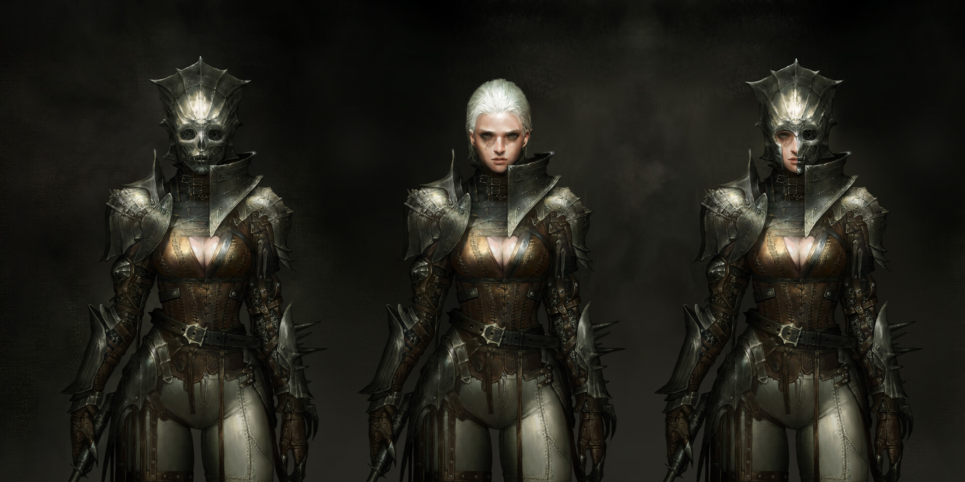
Green Spectre: Pain — Meltifire
In this piece we can see not only the character but one of the key elements of its design, the head accessory that changes the character’s energy completely. The level of rendering and detailing in these pieces is astounding, the brush technique sets the mood for the character and story, and the dark color palette adds drive to the aesthetic.
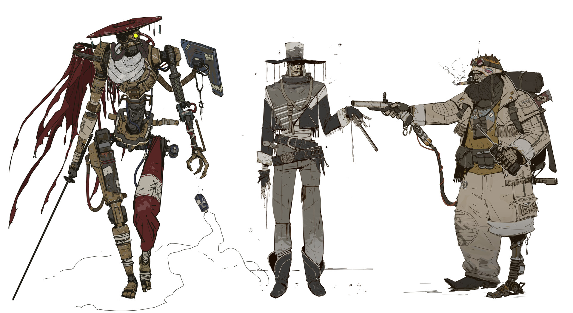
Weary People — Kim Seongchol
These amazing designs are a great example of how much shape language can affect the energy of our designs, and the personality of our characters. The rough coloring style sets the mood for a brutal reality and conveys the lonesomeness message quite well.
Arcane: Chem Berserkers — Victor Maury
Every scene in Arcane is a work of art and a great source of inspiration for artists, and getting to know the “behind the scenes” is an honor. Amazing piece by Maury where we can see some design variations for these terrifying characters.
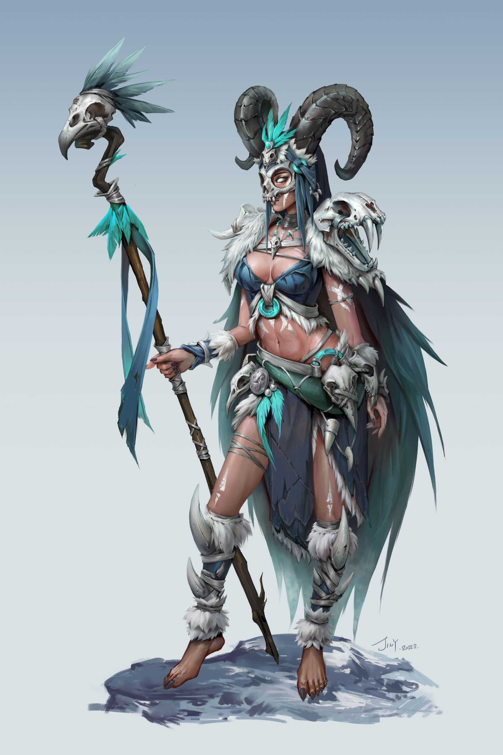
Shaman — Yang Jin
This piece combines multiple elements, shapes and textures to bring this character to life. Just by taking a look we get to know the role and some of the story behind this character and making that possible is one of the challenges of concept art. Amazing work by Jin!
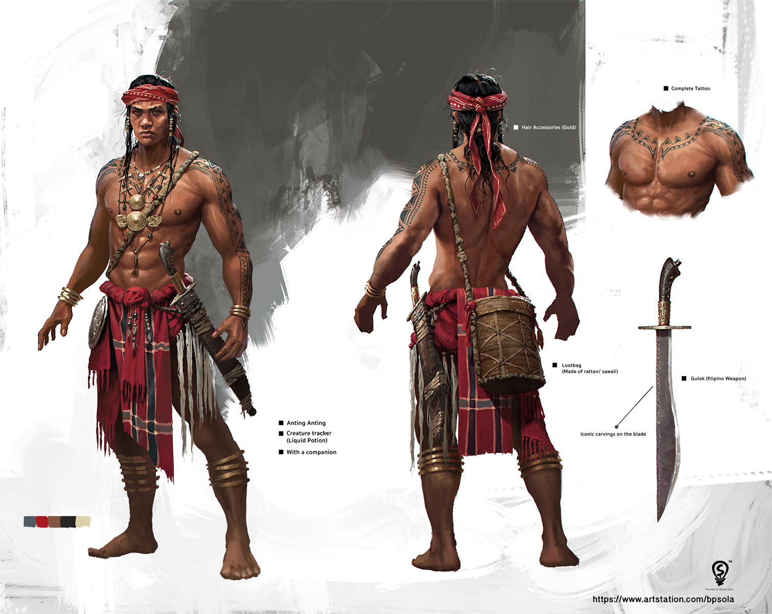
Main Game Character — Bryan Sola
In this gorgeous design, we can see the final result of a major exploration, where multiple elements harmonize with the character and set his mood and personality. The rendering is astounding, and the attention to the detail is impressive. In the artist page we can see the changes this character went through to get to this final stage.
Unit 09 — Abrar Khan
Going for a more futuristic vibe, this amazing piece of concept art is part of a cyber-corp series of the artist’s personal work, marvelously executed, with a strong shape language and bold contrasting colors, this piece seems to be taken straight from a not-so-distant reality.
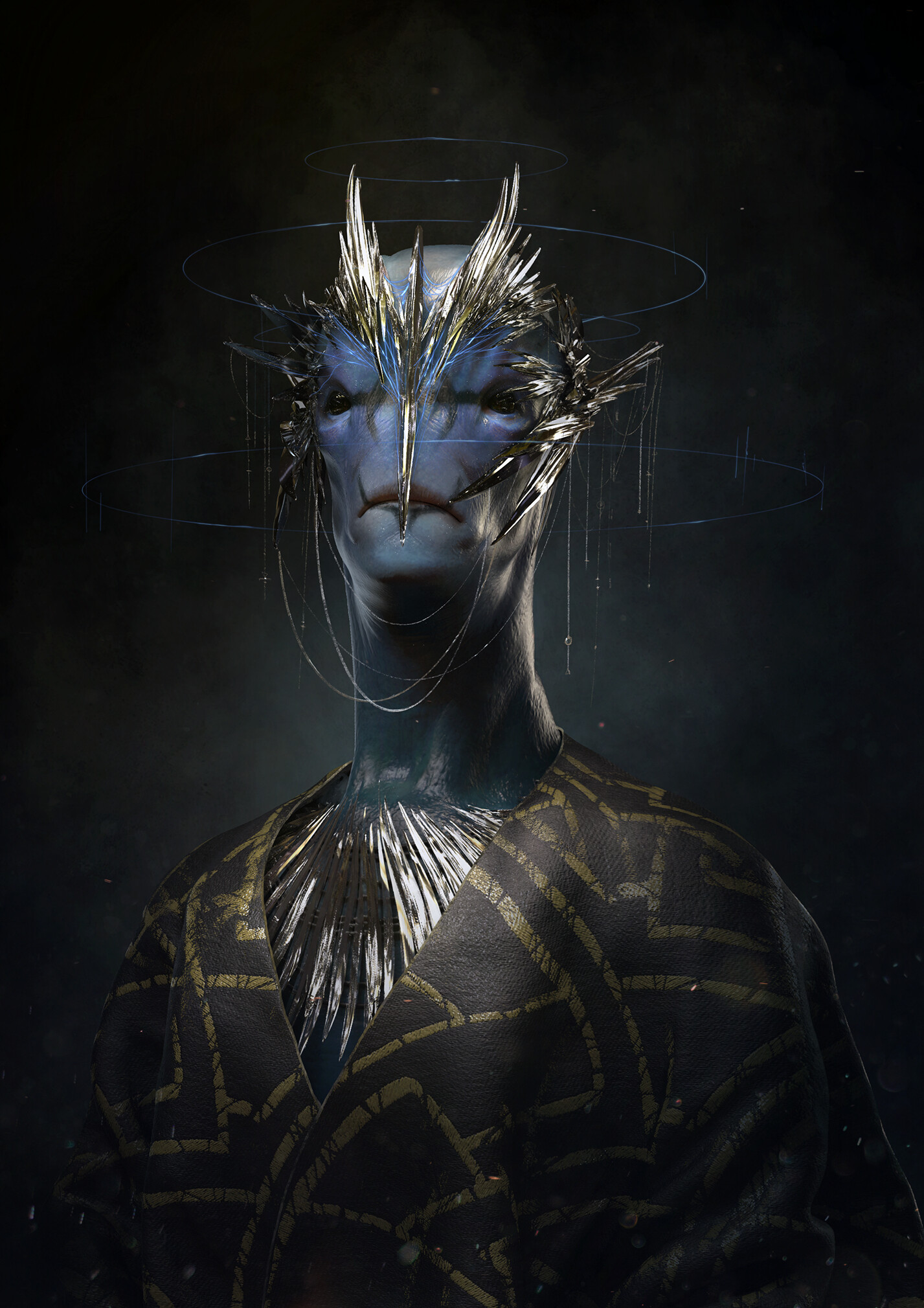
Blue Royal — Pablo Munoz Gomez
The message that this piece transmits takes us straight out of this world, the golden accents, the textured skin and blue hues merge everything together making it visually appealing and intimidating at the same time. Amazing work by Gomez, considering this was done in one live session, his educational content is definitely worth checking!
White Hunter — 鑫ZAI007
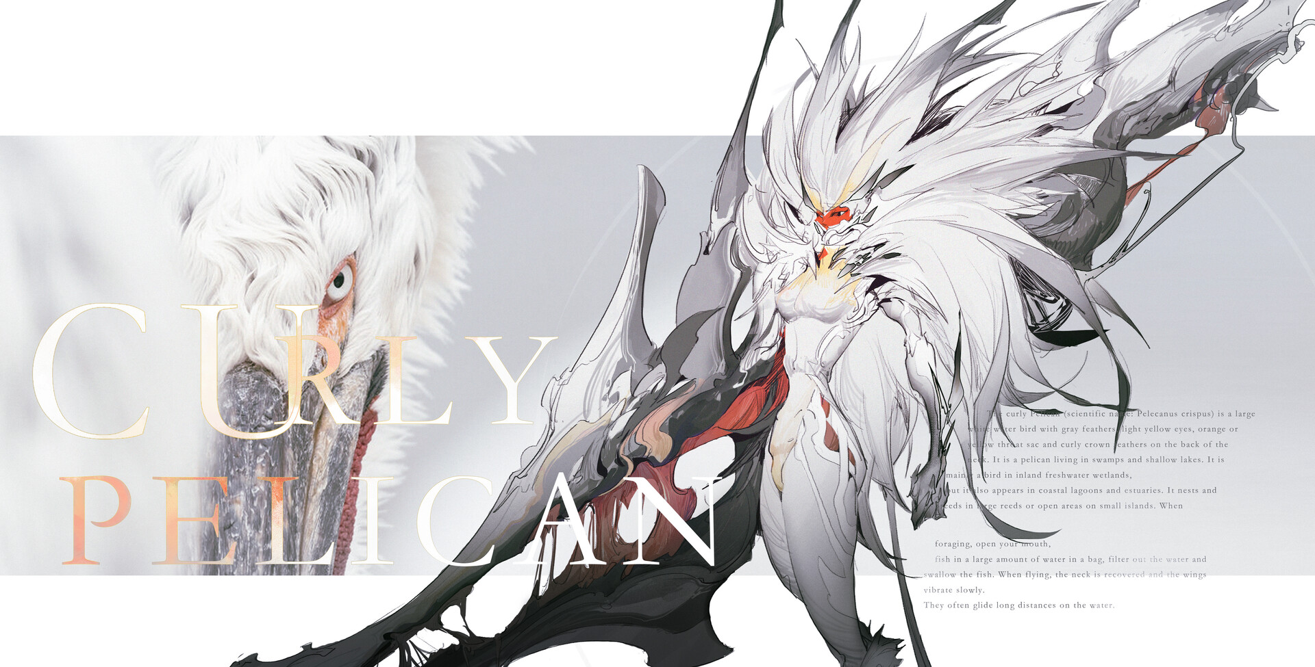
This piece has a great shape language, the dynamism and flow in every trace the artist made, the gesture of the character’s figure and the fantastic concept based off the Dalmatian Pelican along with the rough coloring style make it an amazing piece of character concept art.
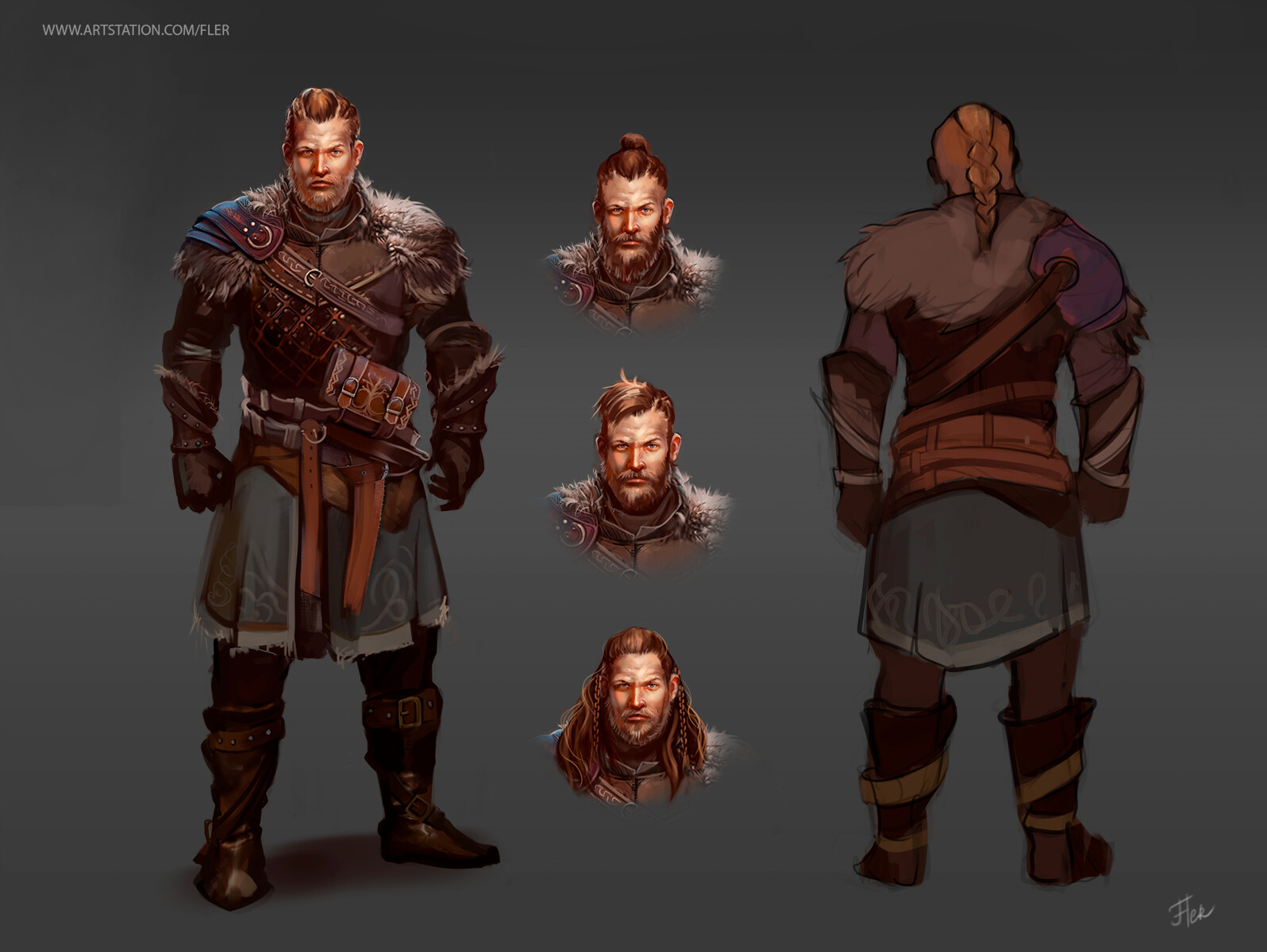
Soulborn Concept Art — Alexandra Malygina
In this piece we can appreciate how the mixed use of shape language and warm colors can set the energy of a character. Additional to that, the mix between detailing and a rough painterly style give this character a special vibe of strength and confidence.
Sentinelle: Inkorporate — Charles Sauvat
Sauvat’s works are always characterized by its crudeness and strong energy, making an almost instant visual impact, some of the elements that contribute to that in this piece are the use of high visual contrast and ropy shapes, making a great post-apocalyptic character design.
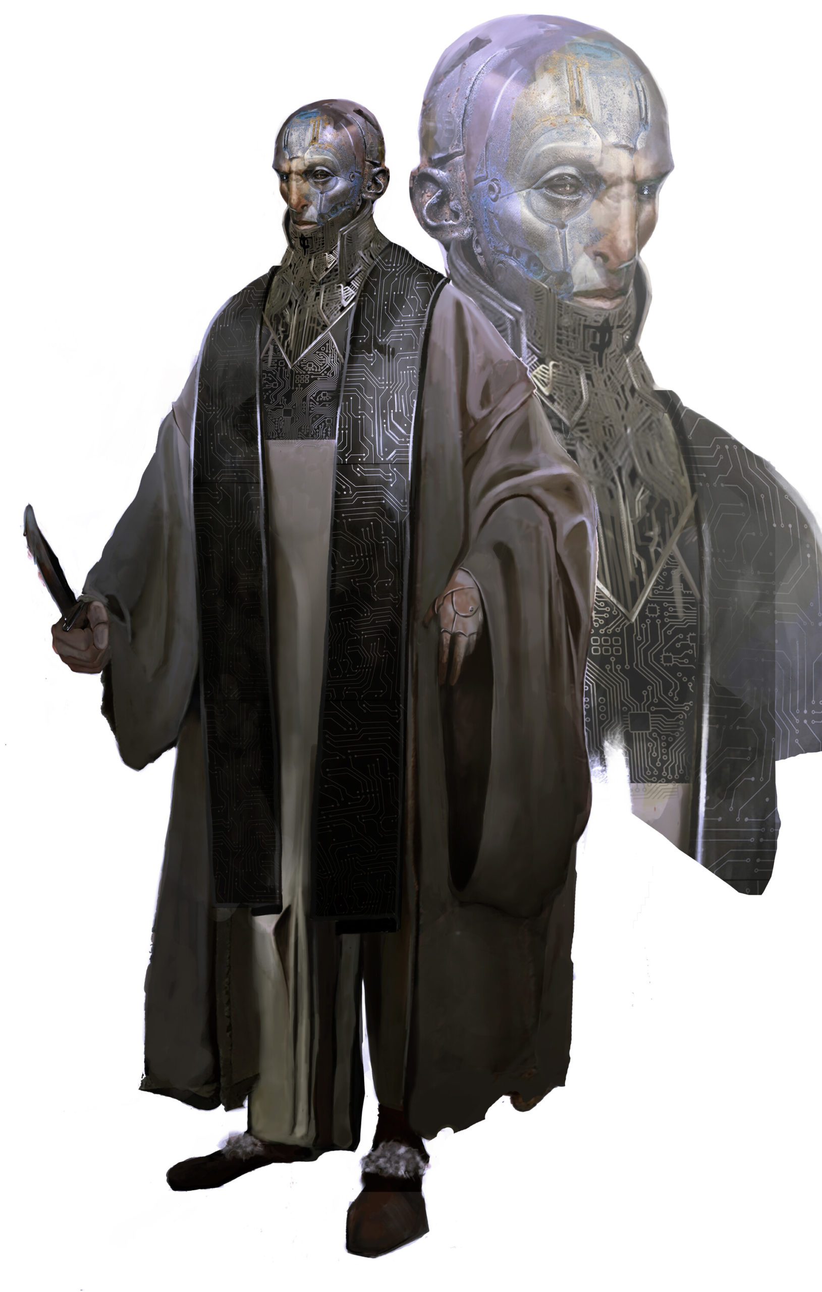
Ashpool_Neuromancer — Andrea Bellini
In this piece we can appreciate how the right use of textures mixed with soft painterly techniques and the intentional loss of focus on the lower half of the character only helps enhance the defined shapes and guide the viewer’s attention to the focal point of the piece.
Syra: Cyberpunk Character Design — Sam Hoggs
These gorgeous designs were part of the exploration of possibilities for Syra, a personal project of Hoggs. Here we can see how playing with shapes and textures before going for a final choice is very important when creating a character for a set universe.
Guardian of The Stone Forest — 鑫ZAI007
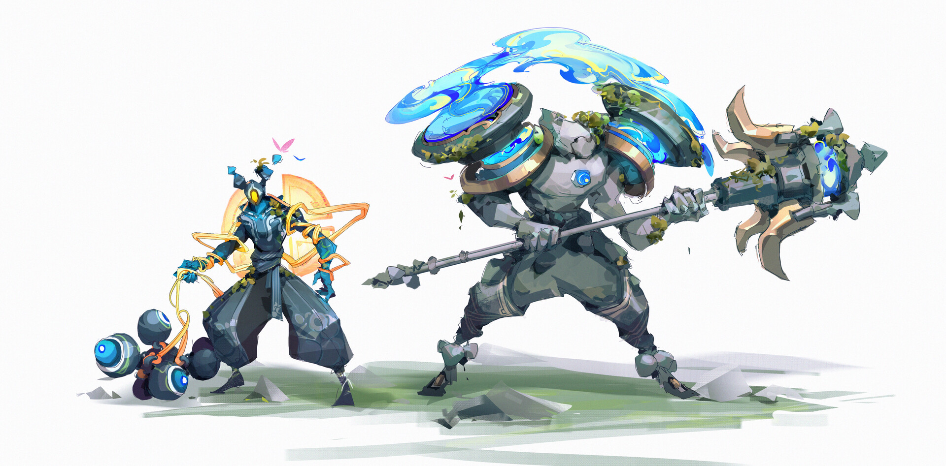
Another amazing work by 鑫ZAI007, where they don’t only explore the character concept, but also their integration with other characters from the same universe, creating a concept full of possibilities.
