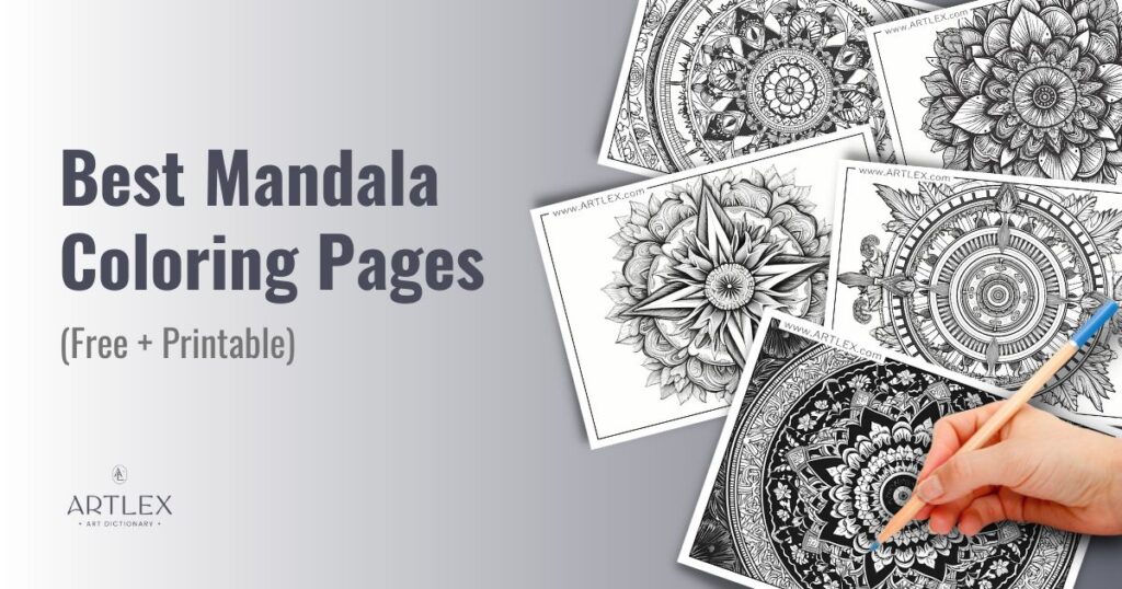
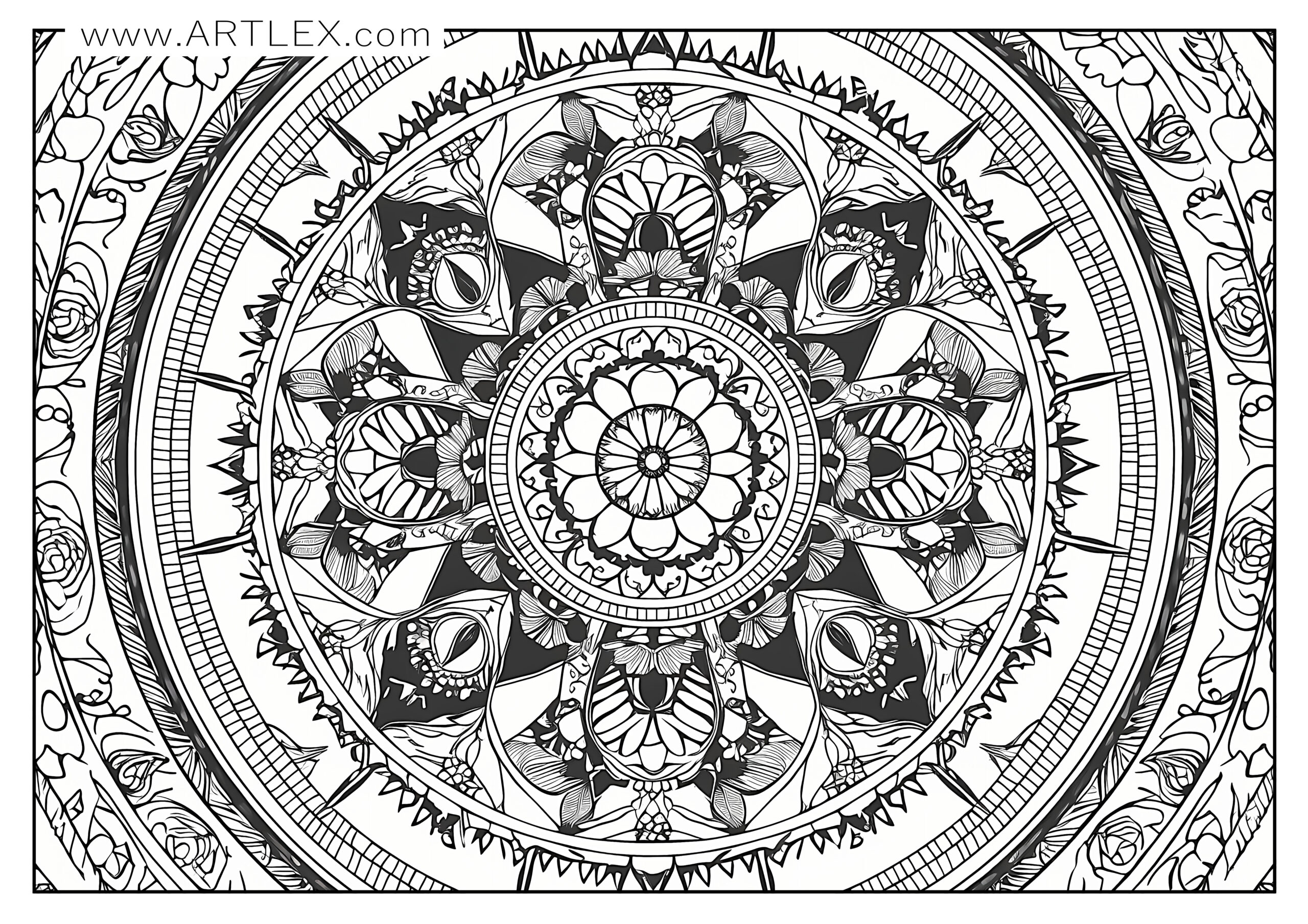
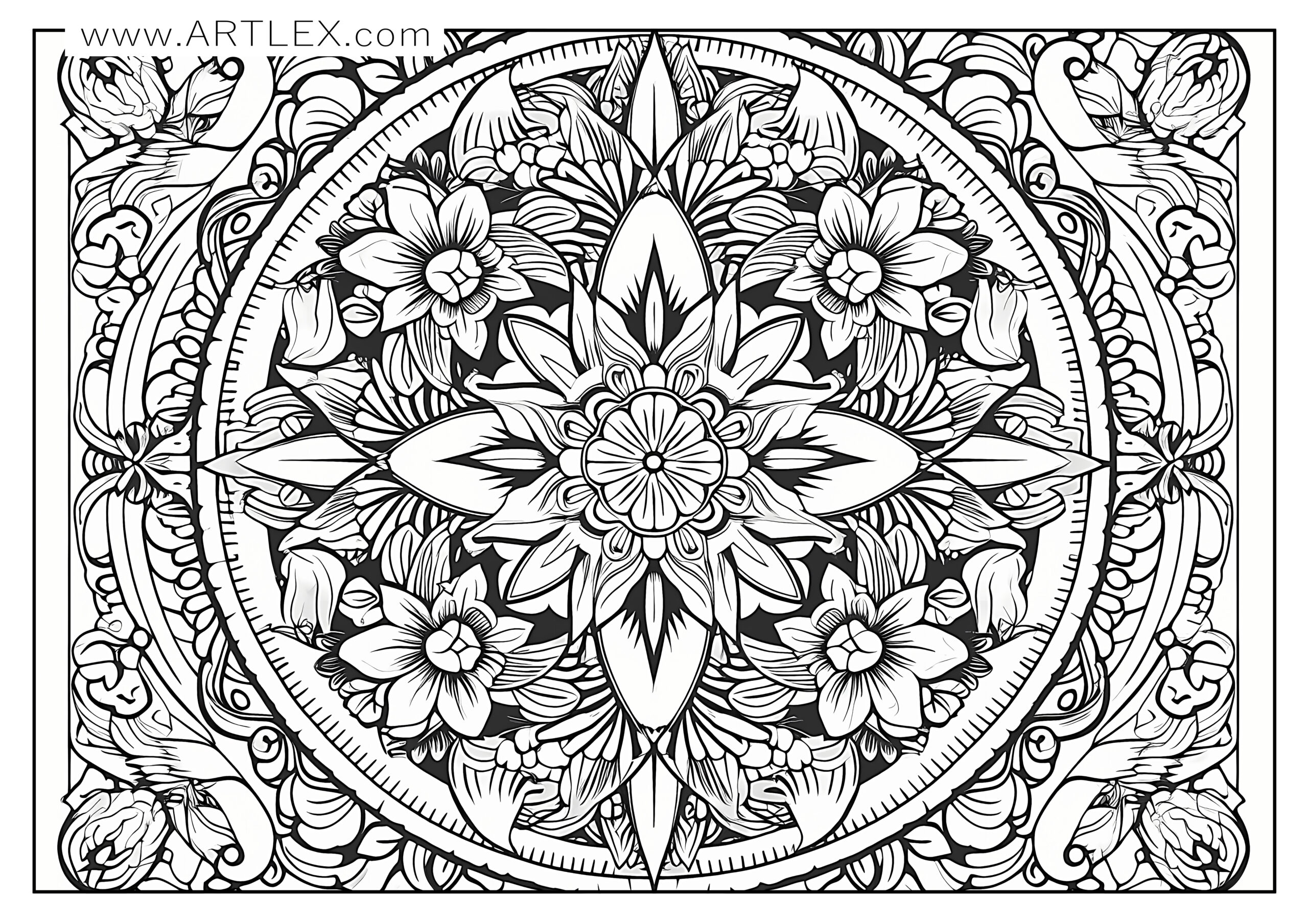
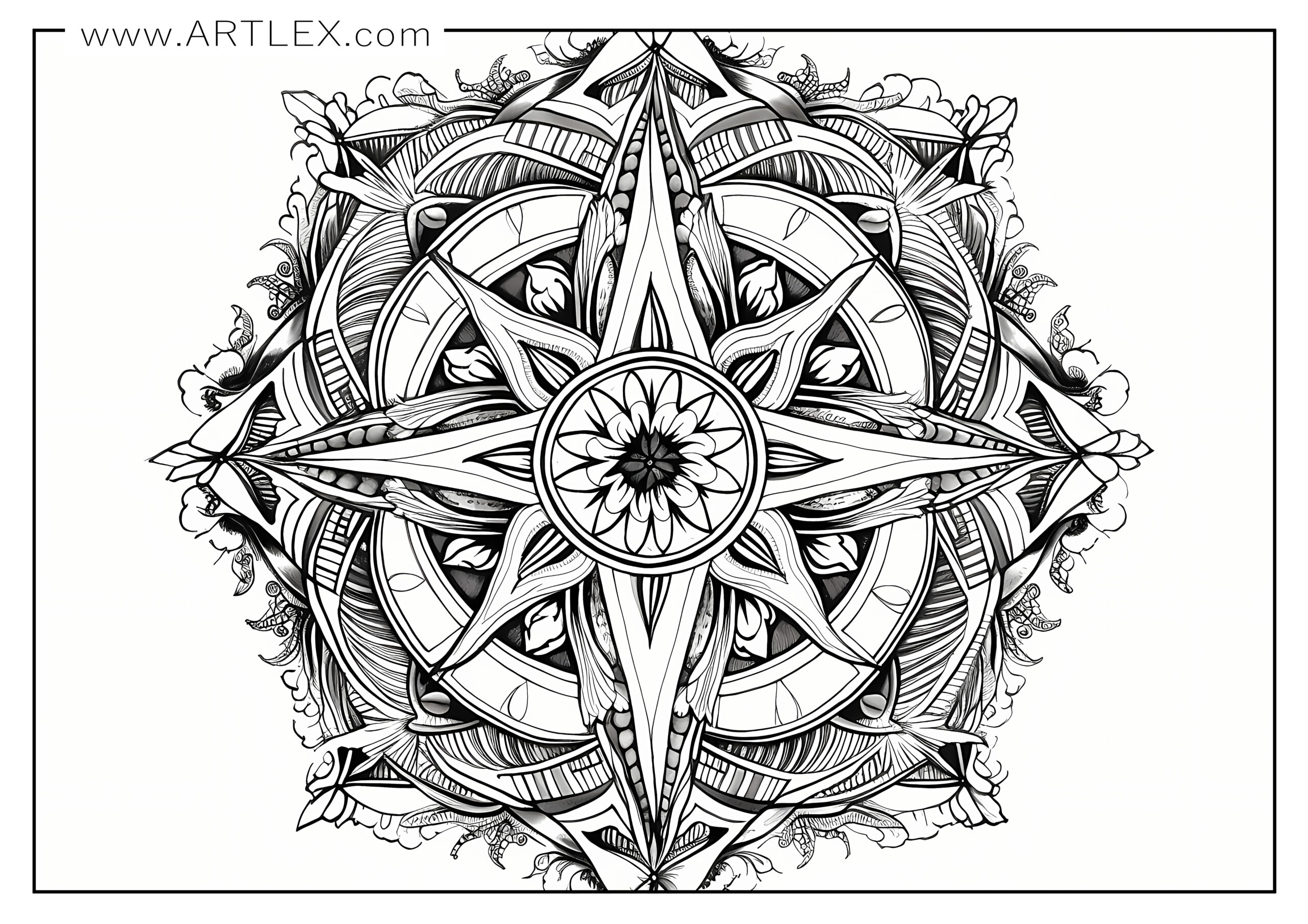
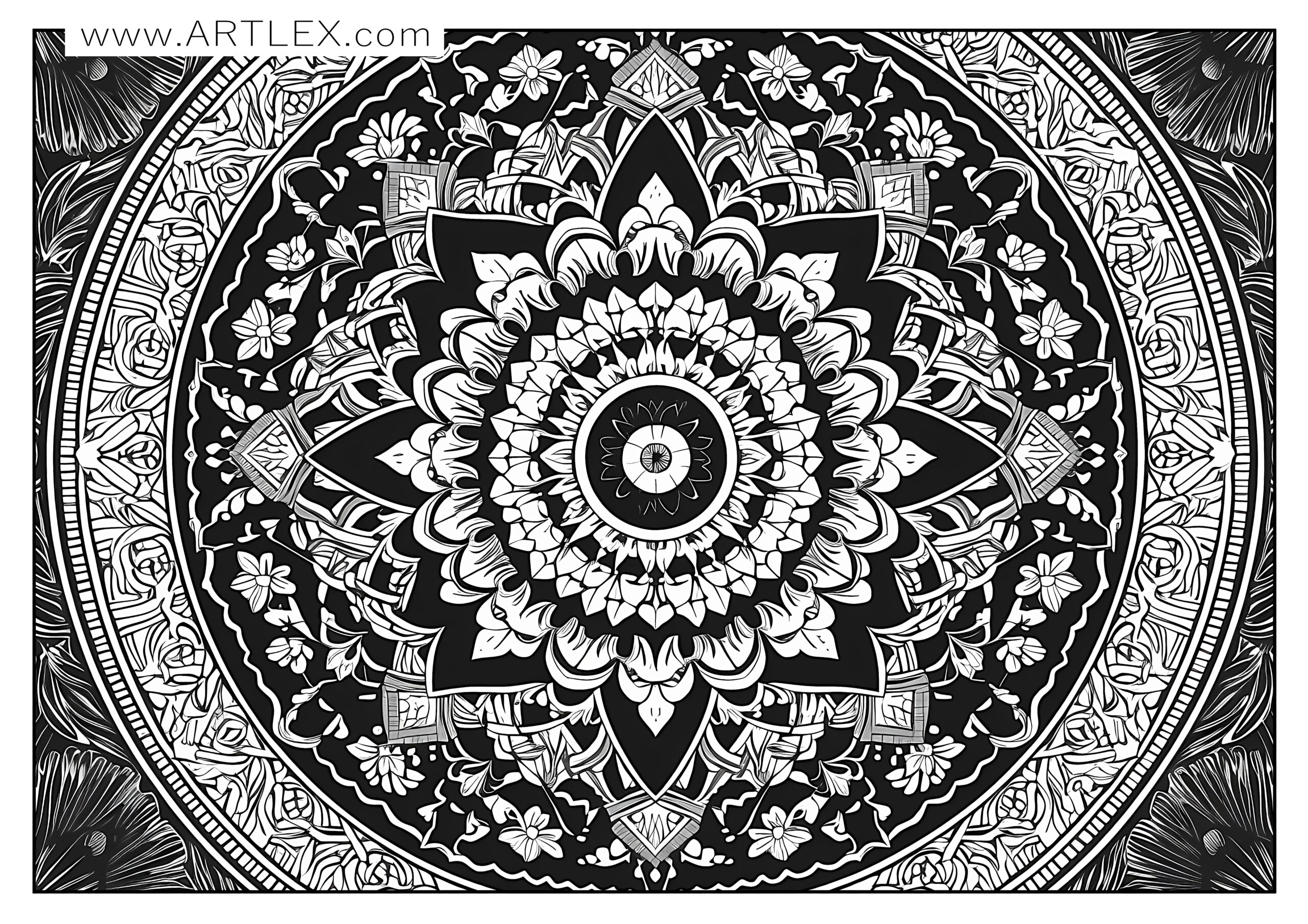
Mandalas, derived from the Sanskrit word meaning “circle,” represent wholeness and harmony. Originally a spiritual symbol in Hinduism and Buddhism, they’re traditionally used for meditation and prayer, guiding individuals toward a path of self-introspection and enlightenment. However, their geometric and intricate designs have found a unique place in the world of art and creativity.
Mandala coloring pages provide a wonderful platform for stress relief and relaxation, the act of filling in the repetitive patterns encourages the mind to focus on a single activity, while the choice of colors used allows for self-expression. The symmetry of the Mandala design provides a sense of balance and order, which can have a calming and soothing effect, especially these days when overstimulation is so common.
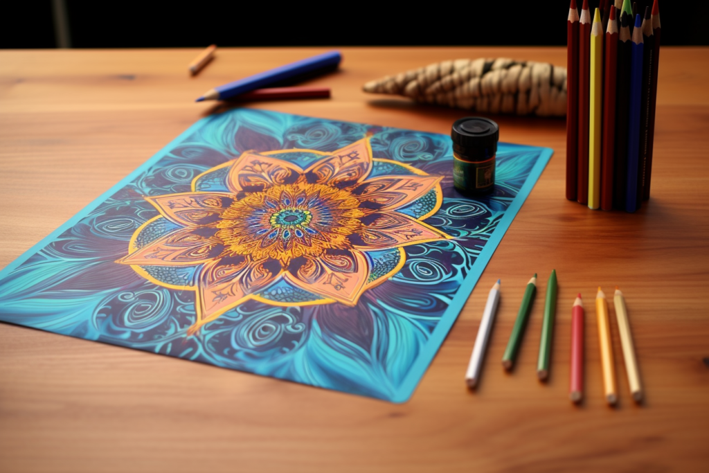
Whether you’re an experienced artist, a beginner looking for a therapeutic activity, or a parent seeking engaging and educational content for your children, Mandala coloring pages offer a rewarding and enriching experience. So, grab your colors and get ready to embark on an artistic journey into the captivating world of Mandalas.
Recommendations
Now, let’s talk about some tips for a stress-free coloring experience.
- Before you get started, make sure to choose a well-lit and comfortable space to work in. It’s also important to select appropriate coloring pages and supplies, including the right coloring tools and paper.
- Since our coloring pages are very high quality, you’ll be able to print them on any surface your printer supports. You can use thicker paper as well as cardstock or even watercolor paper. If you’re feeling adventurous, you can also print on paper that supports gouache or acrylic paint.
- We don’t advise you to paint with wet mediums (watercolors, gouache, inks) if you’re printing with an inkjet printer since the inks are dye-based and not resistant to water; on the other side, if you have a laser printer, then you’ll have nothing to worry about.
Take your time and remember to relax and have fun while you color – this is supposed to be a fun and therapeutic activity, so don’t stress and enjoy!
Now, let’s talk colors!
There is no hinder to your creativity in mandala coloring or color palette limitation, you can choose whatever combinations and techniques you want for your mandalas. However, sometimes a bit of help is always useful so here are some pieces of advice on color schemes for your mandala coloring pages.
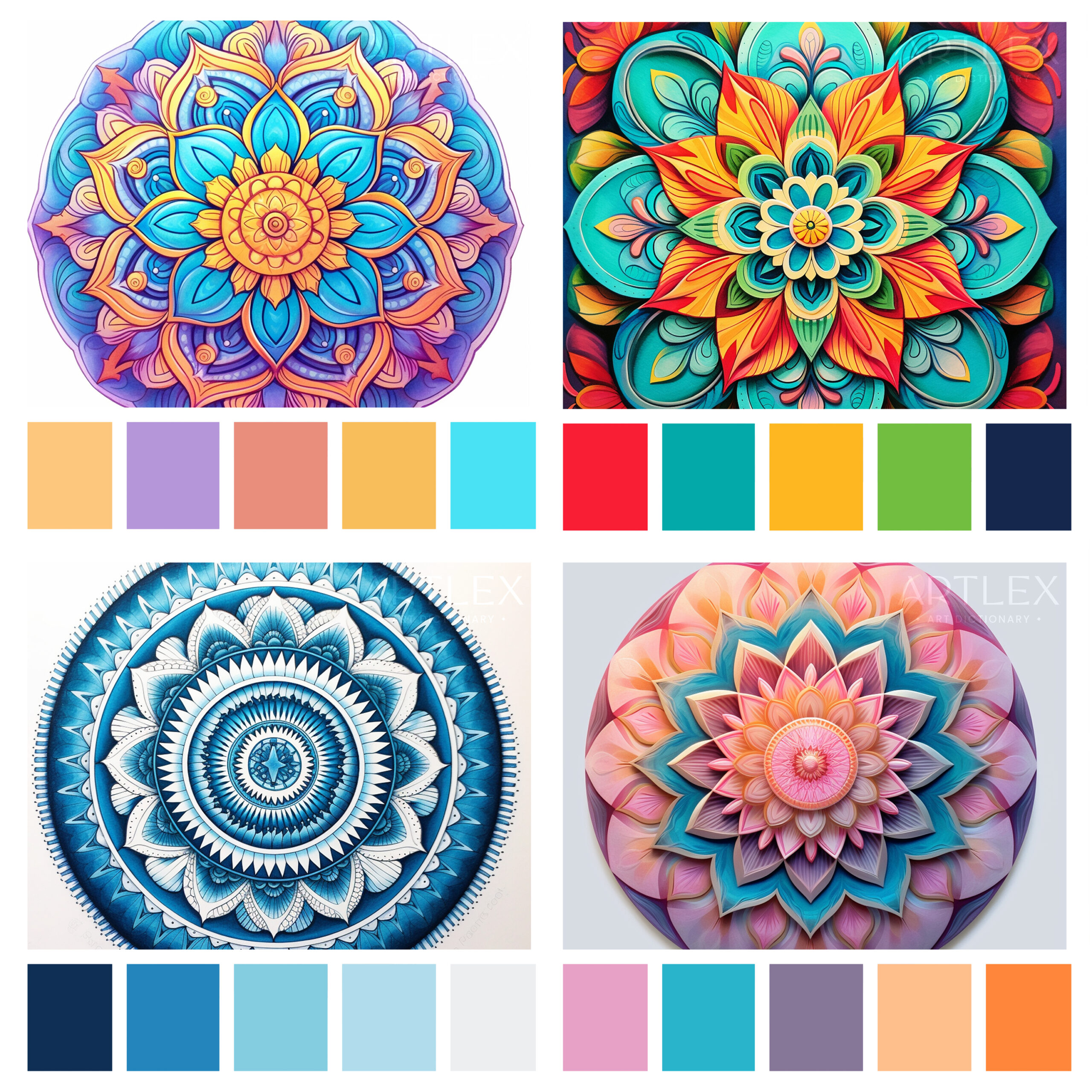
- Monochromatic Magic: Choose a single color, and use various shades of it. For instance, if you choose blue, you could incorporate sky blue, navy blue, baby blue, and cobalt. It’s simple, but the end result can be mesmerizing!
- Rainbow Rhythm: This color scheme involves all the colors of the rainbow. You can start with red at the center and work your way out to purple, or vice versa. It creates a vibrant and joyful mandala.
- Nature’s Palette: Drawing inspiration from nature, you can use greens, blues, browns, and yellows. Think of forests, oceans, and sunsets. This can create a peaceful and calming effect.
- Warm or Cool Tones: Warm tones like reds, oranges, yellows, and pinks can give your mandala a fiery, energetic feel. On the other hand, cool tones like blues, purples, and greens can evoke calm and serenity.
- Black and White with a Pop of Color: Primarily use black and white or grayscale and then choose one bright color for a certain section of the mandala to make it stand out. This can create a nice-looking contrast and bring the focus to the colors.
- Pastel Dreams: Use soft, muted tones like pastel pink, blue, purple, green, and yellow for a soothing and dreamy aesthetic.
Some additional tips to keep in mind:
The center of a mandala represents the origin of life. Starting here and working your way outwards can help maintain symmetry and provide a natural progression to your work.
- Colors can greatly impact the mood and energy of a mandala. Reds and oranges might lend an energetic, passionate feel, while blues and greens can evoke tranquility. You may want to think about the mood you’d like to create before selecting your colors.
- Try blending colors together to create smooth transitions or gradients. This can add depth and dimension to your mandala.
- Consider using contrasting colors to make certain areas of your mandala pop. Contrasting colors are those that are opposite each other on the color wheel, like red and green or blue and orange.
- Lastly, don’t worry about making mistakes. Coloring is a personal and creative process. What matters most is that you enjoy it.
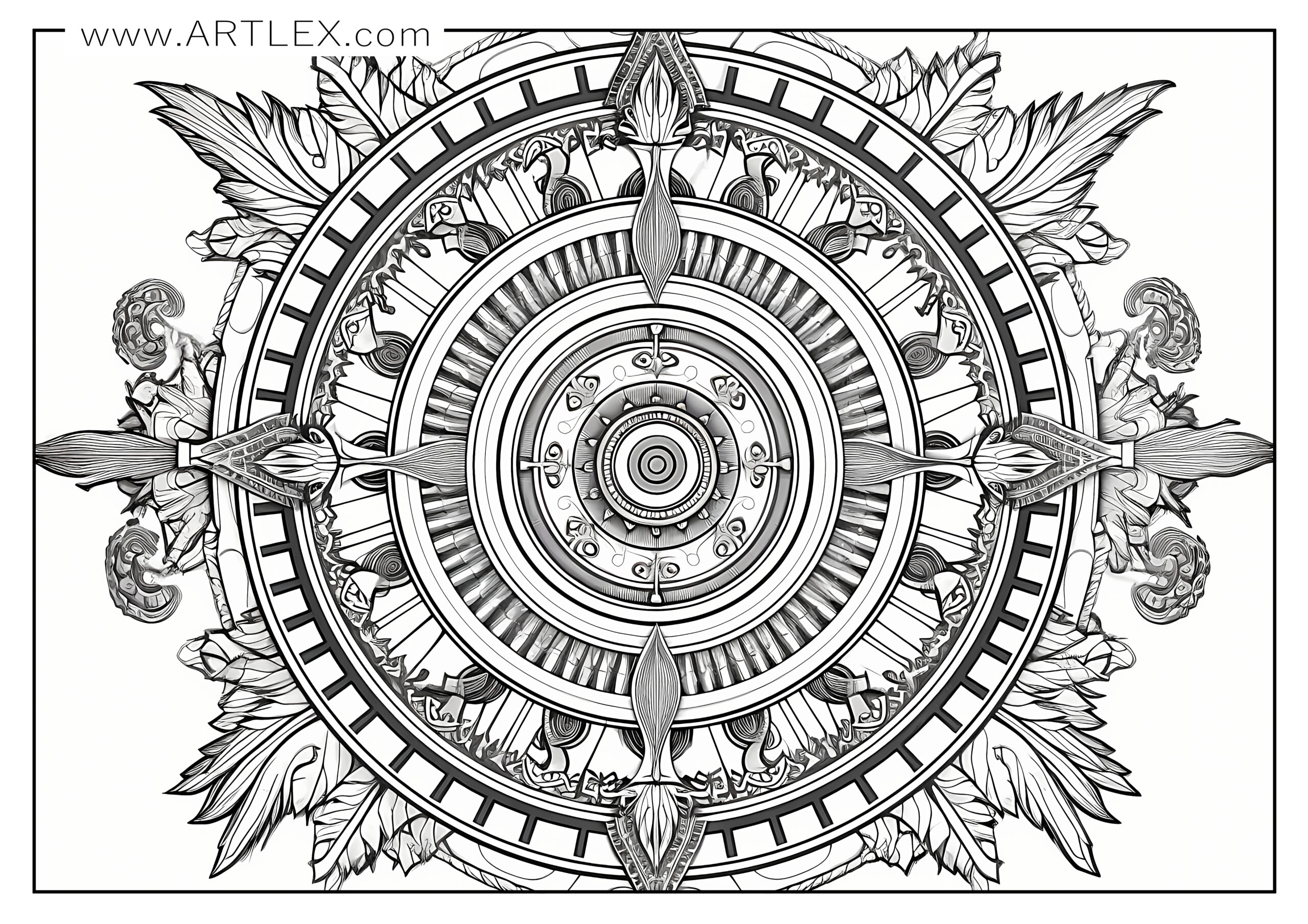
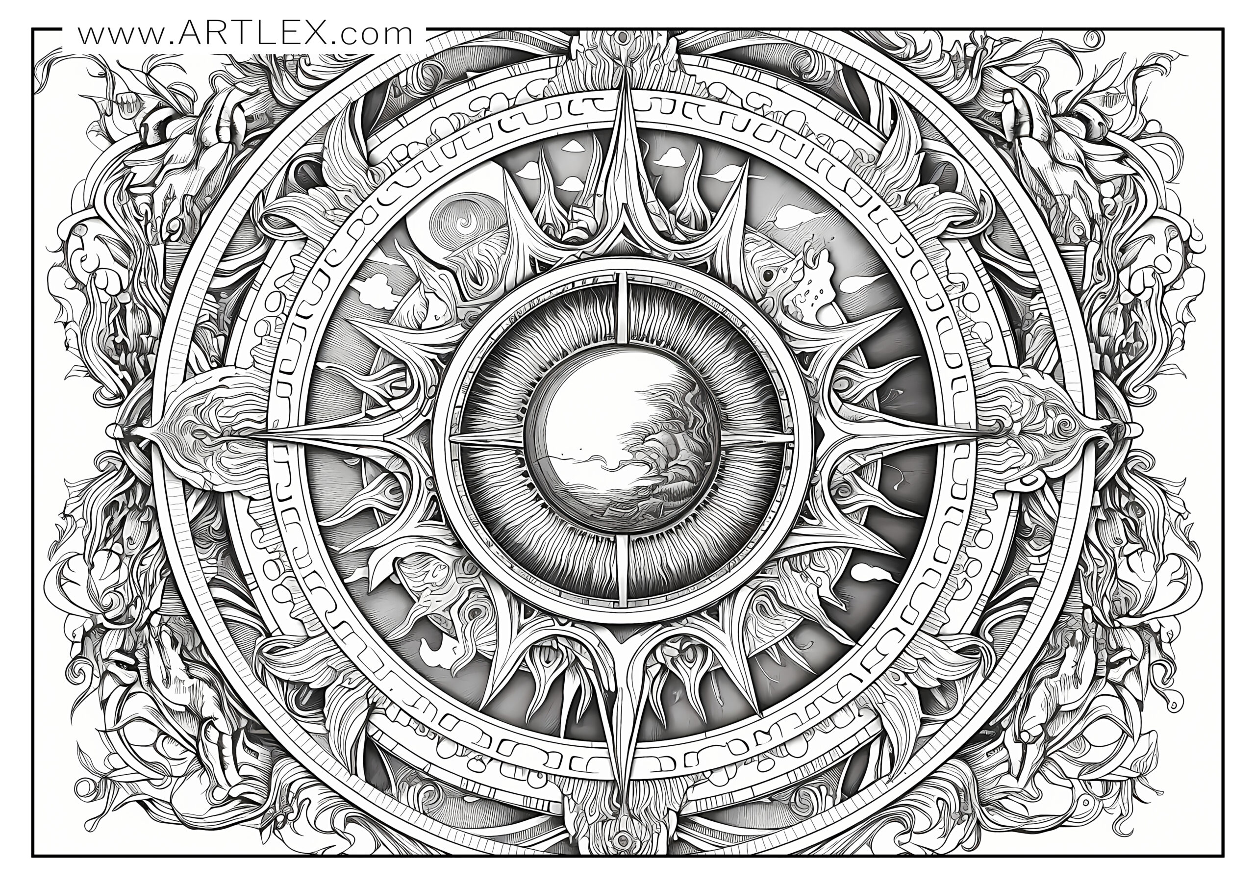
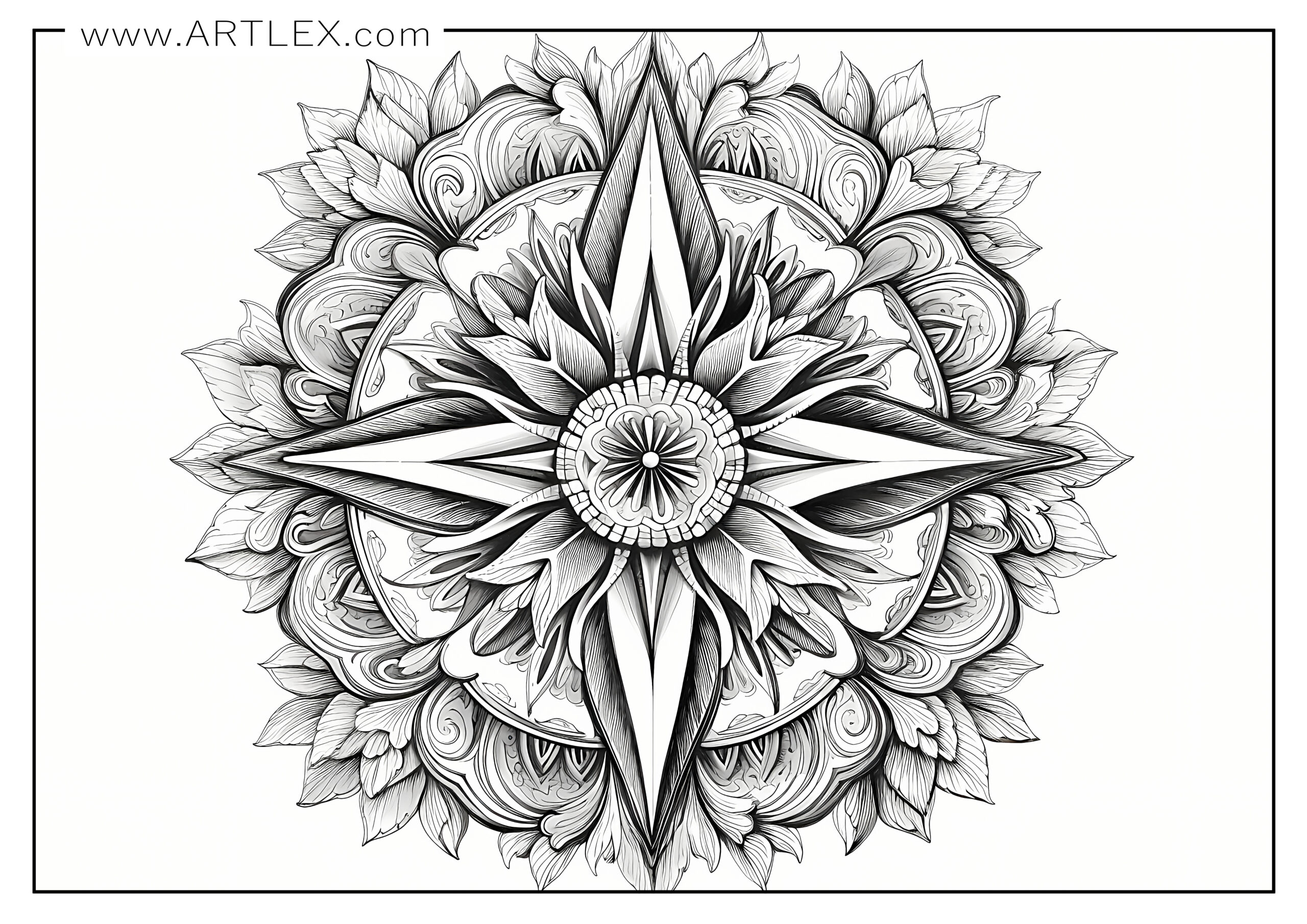
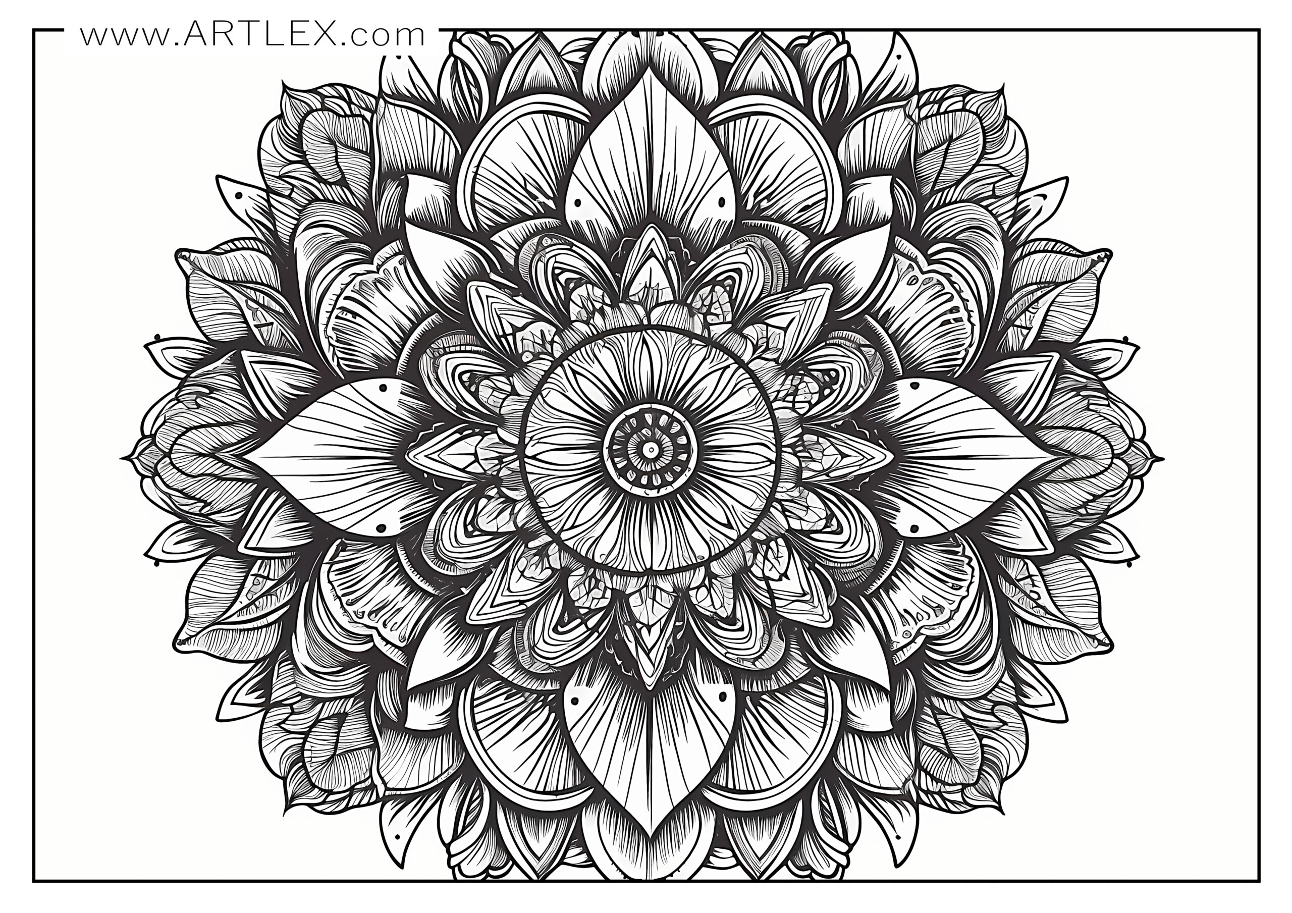
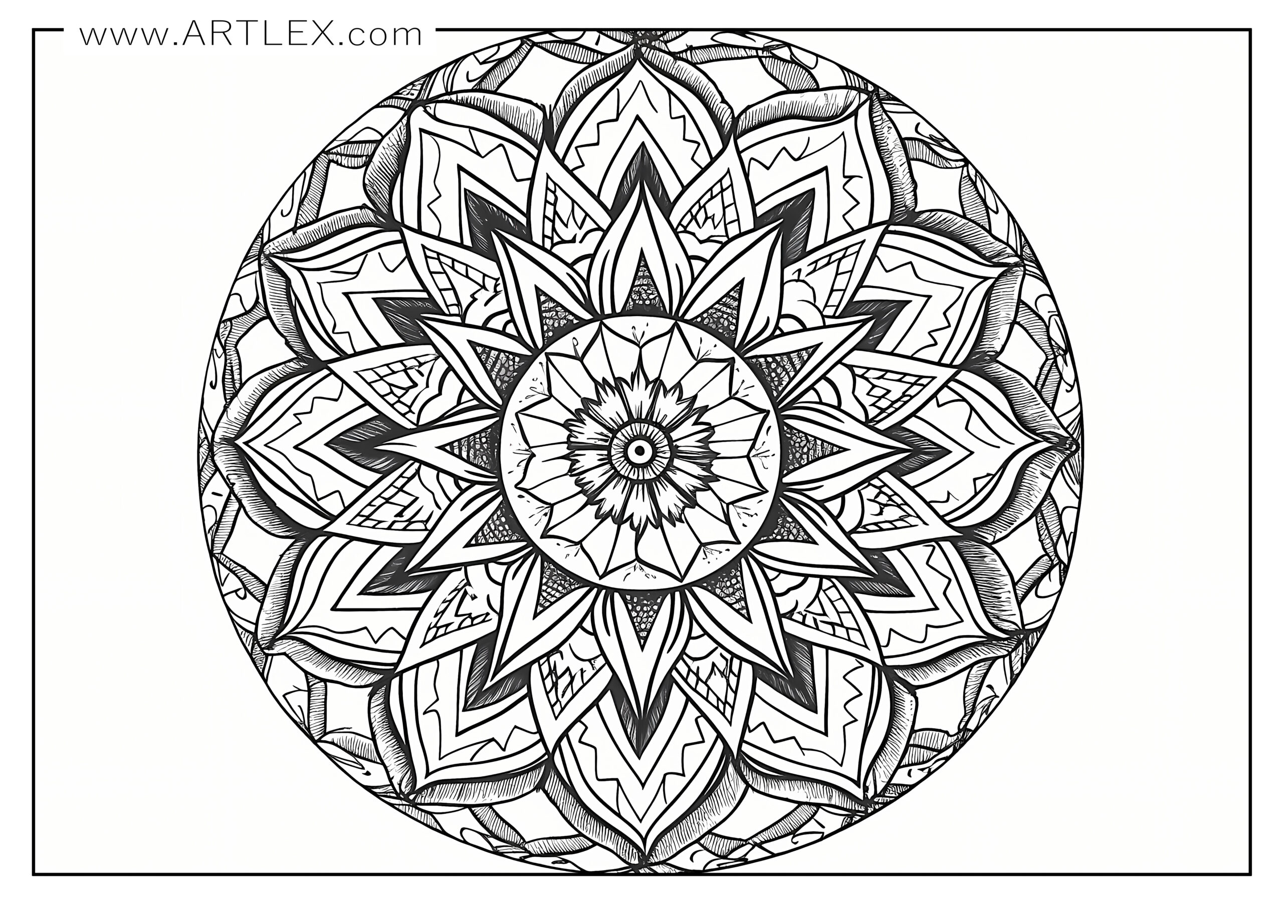
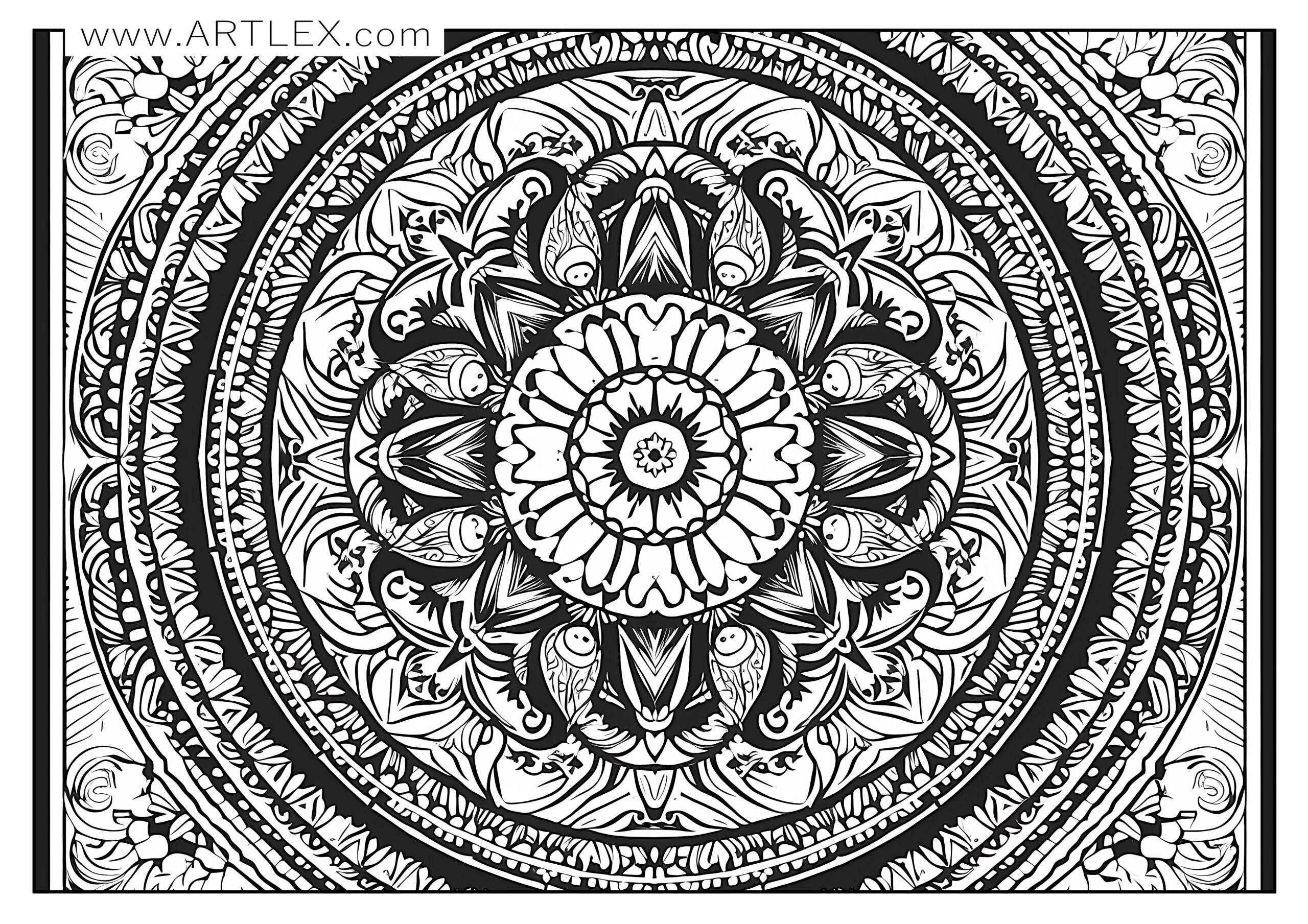
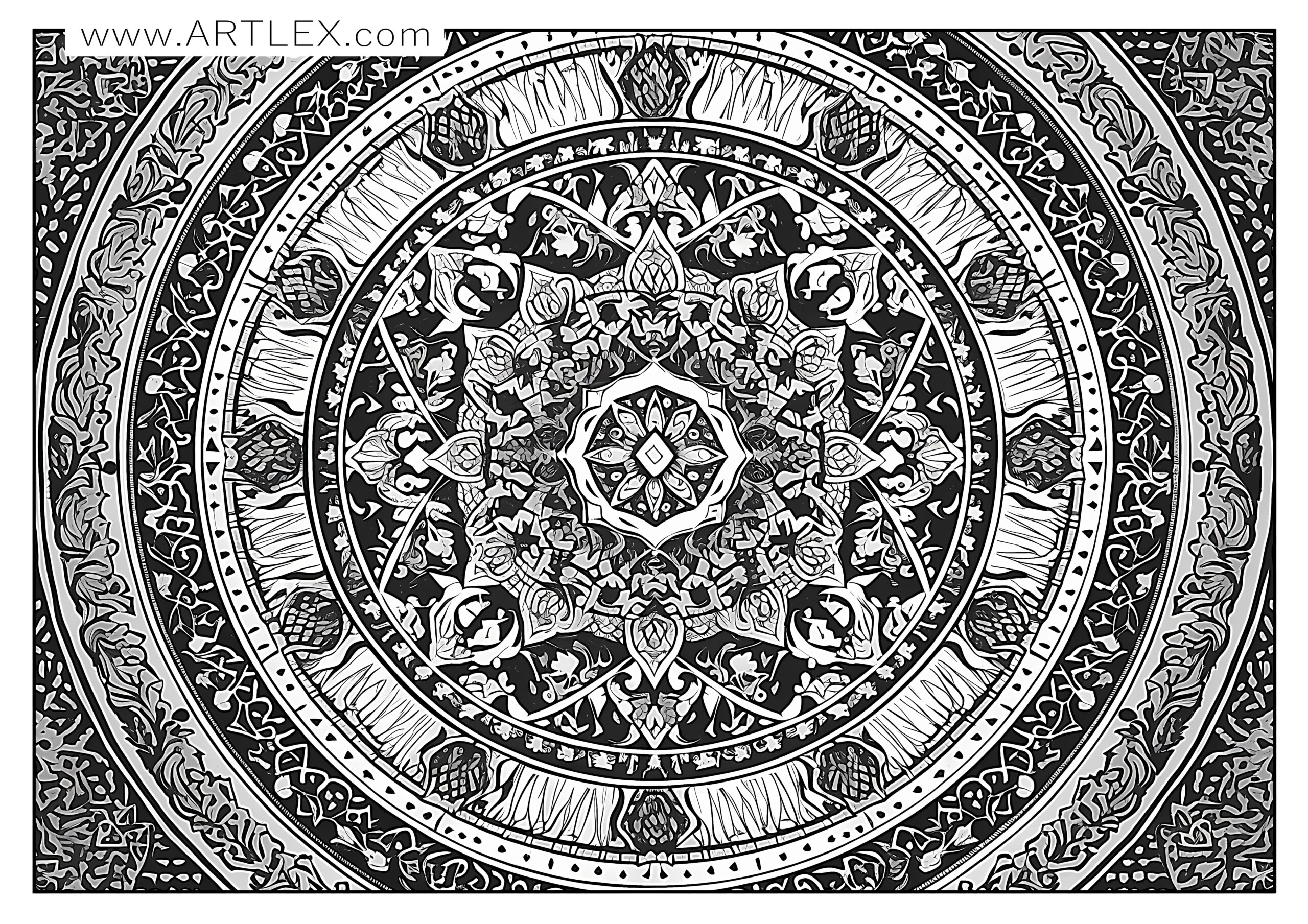
When it comes to choosing the right materials, there are a variety of options to consider, that’s why we’ve prepared a selection of recommended materials so you can enjoy your coloring journey even more. Although many say that having better supplies won’t make you a better artist, it for sure can improve your experience a lot!
Good art supplies will take away most of the frustration and lack of control bad art supplies have and will make your work look much better, with brighter, more intense colors, will last more and are a delight to use.
Here is a list of recommended materials and brands:
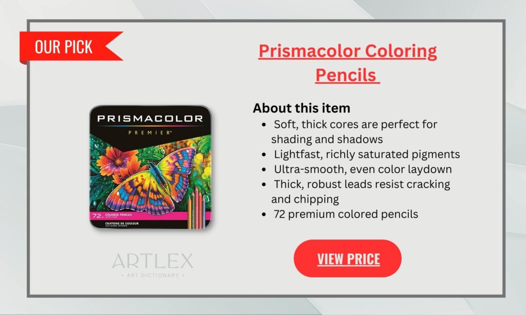
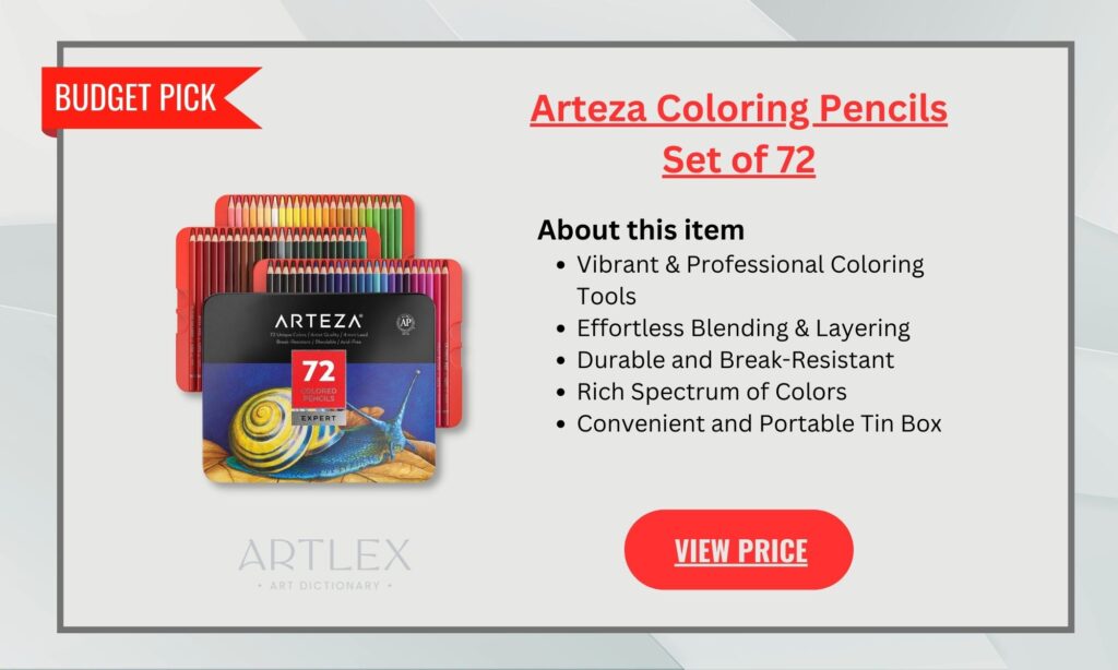
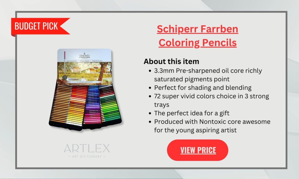
Coloring Pencils:
Everybody knows that there is nothing better than Prismacolor, they have the softest coloring pencils, the most intense pigments, and the highest quality, however, they are quite expensive as well. Because of that, we’ve prepared two alternatives that will give you the best results without hurting your pockets as professional colored pencils would.
Paper for Coloring
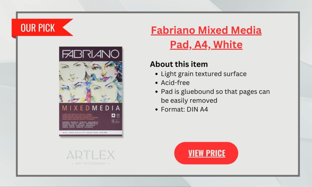
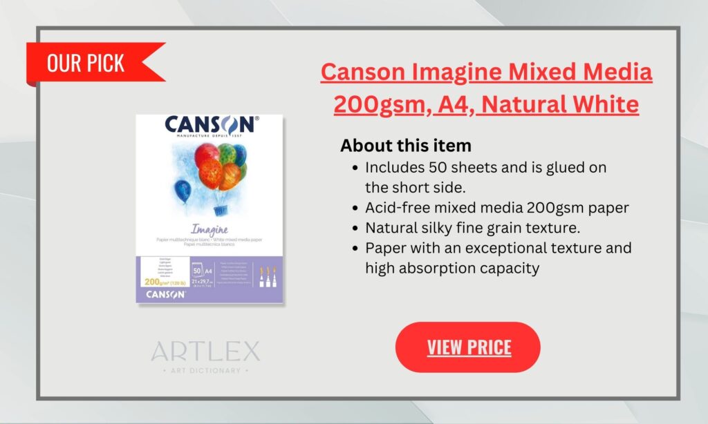
You don’t need special paper for coloring, however the experience of coloring on paper that is more resistant, that has texture or that grand the pigments better is something I suggest you try. There are many types of paper for art, each one made with a specific medium in mind, however, there is also an “all-in-one” paper where you can try different mediums and experiment all you want without worrying. These two brands have great quality and are not as expensive as other professional brands. Remember, if you are going to use any kind of “wet” medium, make sure you’re printing with a laser printer.
- Fabriano Mixed Media
- Canson Mixed Media White
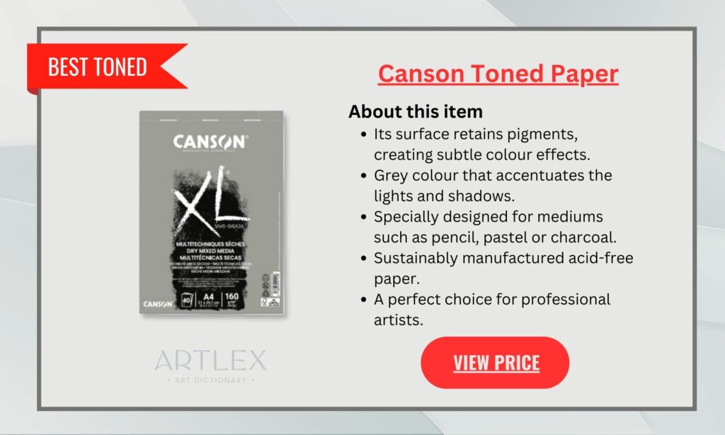
Coloring on top of white paper can affect how our brain perceives values and colors, so it’s always recommended to try toned paper. The gray tones on the paper will give your brain a base that is neutral and will force it to work with colors differently. You will learn about value and your coloring pages will look amazing with a darker background.
Accessories:
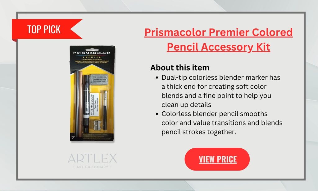
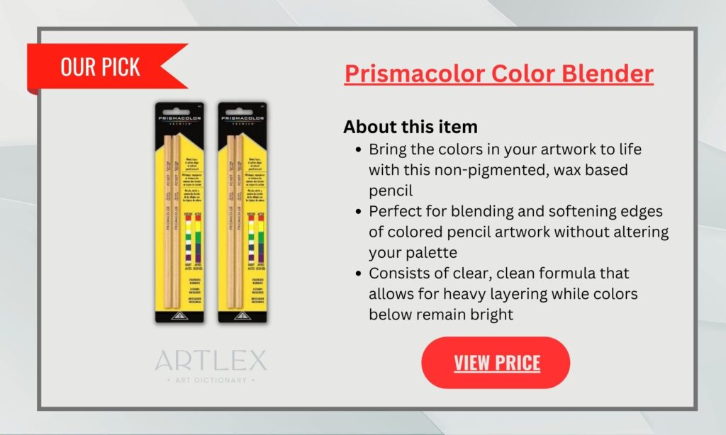
We couldn’t forget about all the accessories you need to bring your coloring to the next level! You don’t have to buy them all, of course, however, we do recommend you get the color blender and the electric eraser or the electric sharpener if you don’t have a good sharpener at home.
Colored pencils and markers are great for traditional coloring and fine detail work, while watercolor pencils allow for a more fluid and blended look. If you’re feeling adventurous, try using markers and gel pens to add bold and vibrant colors to your pages.
And remember, with the right color palettes and supplies, you can bring your coloring pages to life. So grab your coloring tools and get started today!
Happy Coloring!

